Tuesday 16th September 2014
Perspective
For this project we were asked to take pictures based on 1 point and 2 point perspective. We were shown a slide show with examples of how perspective and depth of field has been used in art and photography. Our task was to take 8 photographs, 4 based on 1 point perspective and 4 based on 2 point perspective.
1 Point Perspective

The above image is a photo I took next to the harborside, I was particularly happy with this shot because the man subjected in the middle of the frame draws your eye to the center of the photo. It clearly shows the vanishing point in the middle of the photo but the man in the photo adds depth and tension to the photo. I chose to convert this image to black and white and change the levels as I think it made the picture look much more authentic and and gave it a feeling that time stood still.

The above image is a photo I took on a bridge on the harbor, this isn't one of the best photos I took as you can't see the vanishing point as well as you can in the other photos. I slightly edited this photo to change the brightness and colours as the lighting and contrast was quite dull and I wanted to give it more life. I think this photo could've been improved by using aperture to focus on the bridge and make the background blurry.

I really like this photo because you can clearly see the vanishing point and I really like the different colors on each side of the photo as they're complimentary colors. I edited this photo to change the brightness and contrast of the photo as I wanted it brighter and bolder.

I took this picture standing on Pero's Bridge and I really like it as it's a simple but effective image. The photo has a clear vanishing point and I like all the different colors of the boats. I changed the color of the water to a slightly more blue shade instead of green as blue water is more visually appealing than green water.
2 Point Perspective

I took this photo in my front garden on an angled wall but wasn't happy with it as I was stood too close to the subject to get effective vanishing points in the picture.

This is a picture I took next to my house, I like this photo because you can clearly see the vanishing points and the center subject is curved unlike most 2 point perspective photos where the subject is pointed. I changed the levels and sharpness of this photo to make the colors stand out more and I think it looks a lot better.

This is my favorite picture I took out of my 2 point perspective pictures. I really like how the colors of the center subject stand out against the dull background. I think I composed this photo well and did a good job on the editing.

This is also another image I wasn't happy with. I again was too close to the subject so couldn't get a good composition or a good angle. Although I dislike this photo I added this to my blog so I can learn and not make the same mistakes in future shoots.
Monday 15th September 2014
Composition
Summary: basic rules of composition
Rule of thirds
Rule of even & odd
Triangles
Space
Simplification
Symmetry
Pattern & Repetition
Tuesday 16th September 2014
Perspective
For this project we were asked to take pictures based on 1 point and 2 point perspective. We were shown a slide show with examples of how perspective and depth of field has been used in art and photography. Our task was to take 8 photographs, 4 based on 1 point perspective and 4 based on 2 point perspective.
1 Point Perspective
The above image is a photo I took next to the harborside, I was particularly happy with this shot because the man subjected in the middle of the frame draws your eye to the center of the photo. It clearly shows the vanishing point in the middle of the photo but the man in the photo adds depth and tension to the photo. I chose to convert this image to black and white and change the levels as I think it made the picture look much more authentic and and gave it a feeling that time stood still.
The above image is a photo I took on a bridge on the harbor, this isn't one of the best photos I took as you can't see the vanishing point as well as you can in the other photos. I slightly edited this photo to change the brightness and colours as the lighting and contrast was quite dull and I wanted to give it more life. I think this photo could've been improved by using aperture to focus on the bridge and make the background blurry.
I really like this photo because you can clearly see the vanishing point and I really like the different colors on each side of the photo as they're complimentary colors. I edited this photo to change the brightness and contrast of the photo as I wanted it brighter and bolder.
I took this picture standing on Pero's Bridge and I really like it as it's a simple but effective image. The photo has a clear vanishing point and I like all the different colors of the boats. I changed the color of the water to a slightly more blue shade instead of green as blue water is more visually appealing than green water.
2 Point Perspective
This is also another image I wasn't happy with. I again was too close to the subject so couldn't get a good composition or a good angle. Although I dislike this photo I added this to my blog so I can learn and not make the same mistakes in future shoots.
Composition
Summary: basic rules of composition
Rule of thirds
Rule of even & odd
Triangles
Space
Simplification
Symmetry
Pattern & Repetition
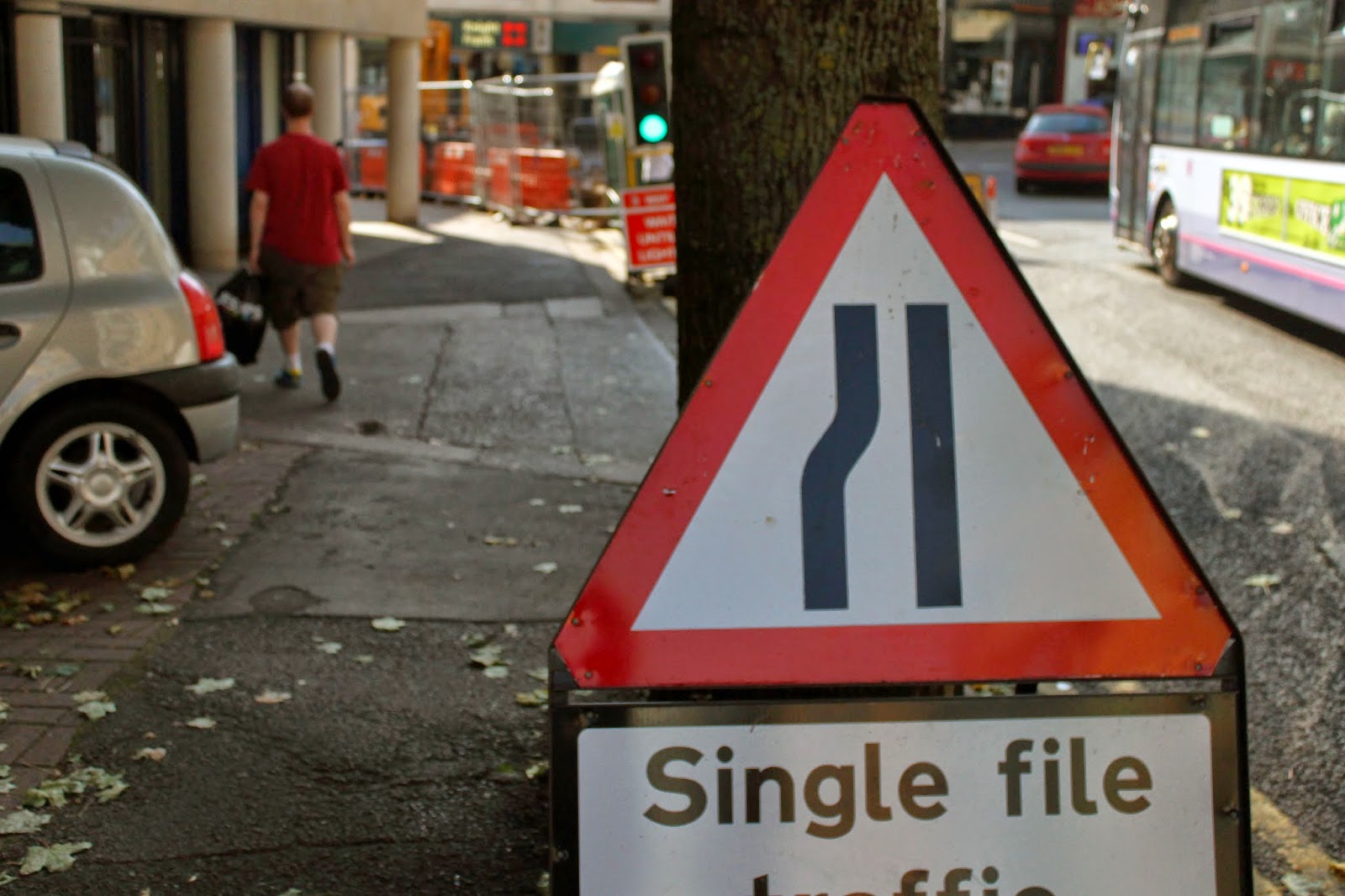
This image uses rule of thirds and also symmetry, the tables on the right balance out the railings on the left. I really like the lighting and simplicity of this image.

This image uses rule of thirds, we can see this because the blue sign takes up 2 thirds of the image, and the other third is empty space.

This image uses rule of thirds, we can see how the sign takes up 2 thirds of the right side of the image.

This image uses rule of even and odd. In this image there is an even number of subjects and this gives the image a really peaceful feel. I decided to make this image black and white and I think this makes the image more effective. What I really like about this image is that we don't know anything about the 2 subjects, whether they know each other or whether they're complete strangers.

This image uses negative space (the sky) and this makes the 4 subjects really stand out. It also uses the rule of even and odd, there is an even number of subjects in the image and this gives it a peaceful feel. The image also uses repetition, we can see this in the 4 cranes which are exactly the same just in different places in the frame.

This image uses rule of thirds because the subject takes up 1 third of the frame. The image also loosely uses space, we can see this because the focus is on the subject and the background is blurred which draws your eyes completely to the statue.

This image uses rule of thirds, space and simplification. The dull colored water makes the swan stand out which is simplification, and also use of negative space.

This image uses both rule of thirds and simplification. The subject takes up one third of the right side of the image and also stands out which shows simplification. The image also loosely uses pattern and repetition, we can see this on the bottom right of the photo on the patterned floor.

This image uses negative space, we can see this because the building stands out against the sky which is the space.

This image uses rule of even and odd and also space. The sky makes the subject stand out and because there is only one subject this gives the image a tense and lonely feel, this is the use of even and odd.

This image uses negative space to focus on the subject, it also uses triangles.

Monday 22nd September 2014
Composition 2
List of visual elements:
Lines
Colour
Shape
Form
Texture
Tone
Colour

This image uses the visual element of colour, I particularly like how the pink and green on the bike stands out against the dull grey background. I also like how the sun is reflecting from the metal parts of the bike and this gives a really nice effect.

This image uses the visual element of colour. I really like how the shadows in the picture look against the light, it shows pattern of the trees above. The different colours in the image stand out against the grey floor.
Form

This image uses the visual element of form. I used aperture to create a narrow depth of field which made the bars at the front really clear, but they slowly get blurrier the further back they go. I really like the effect of this.

This image uses the visual element of form. Again I used aperture to create a narrow depth of field. I really like how the light reflects off the water on the floor and the effect this gives.
Lines

This image uses the visual element of lines. Here you can see lines in the wooden pallet, I like the framing of this image because the subject is in the centre of the frame.

This image uses the visual element of lines, here you can see lines on the road markings. I like the shadows and tone in this image.
Shape

This image uses the visual element of shape, here you can see the butterflies in the image are use of shape. I used aperture to create a narrow depth of field and I like the effect this gives. I also like how the colour of the butterflies stands out against the dull colour of the wall.
This image uses the visual element of shape, here you can see the road sign in the image is good use of shape. I should've used aperture to create a narrower depth of field as I think this would look much better.
Texture

This image uses the visual element of texture. The shutters in this image show good use of texture, as well as colour. I like the lighting and framing of this image.

This image uses the visual element of texture, the rocks in this image show texture. This image also shows good use of tone.
Tone

This image uses the visual element of tone. We can see this in the different light and shadows in the image, this gives a really good effect.

This image loosely uses the visual element of tone. We can see this in the different shadows in the flowers.
Monday 29th September 2014
Shape, Pattern & Texture
Pattern

This image shows steps outside @ Bristol. I chose to take this image close up because you can clearly see use of pattern. I particularly chose these steps because these were in direct sunlight, and doing this would allow me to take a picture in which you could see all of the pattern clearly.

This image shows railing by the harbourside I chose to take this image from below because the composition and angle shows tone and shadows as well as pattern. I also really like the lighting of this image, but to improve it I could've stood closer to the subject and used aperture to create a narrow depth of field.

This image shows the ground by the harbourside. You can clearly see the use of pattern in the bricks, and also tone. I used aperture in this image to create a narrow depth of field, you can see how the front of the image is really clear and the further back it goes the blurrier it gets.

This image shows railings in an alleyway near the college. I used aperture in this image to create a narrow depth of field. I really like the effective use of tone and pattern in this image.

This image shows a wall near the college. I used aperture to create a narrow depth of field. I really like the effective use of pattern and tone in this image. This is my favourite pattern image out of the five pattern images I took.
Texture

This image shows a water feature outside of @ Bristol. I used a medium shutter speed for this image to make the water look flowing but not milky. I like the framing of this image and the lighting.

This image shows a leaf by the harbourside. I used the flash on my camera to show all of the detail and pattern on this leaf. I like the detail of the image but not the lighting or composition.

This image shows rope and net on a boat in the harbour. You can clearly see texture in the rope which is why I chose to take this image. I like the lighting and colour of this image but not the composition.

This image shows a drain outside of the college. The image clearly shows use of texture and I really like the tone in this image.

This image shows rocks outside of the college. I really like the different colours, textures and tones in this image. This is my most effective image out of the five images I took for texture.
Shape

This image shows a .... by the harbourside, I like the framing and tone in this image.

This image shows the ... of a boat in the harbour. I really like the composition, colour and tone of this image. I also like how the subjects in the image stand out against the sky.

This image shows an ice cream van in Broadmead. This image shows clear and effective use of shape, colour and tone. I like the composition of this image but not the lighting, I think the image is too dark.

This image shows a pedestrian crossing button in broadmead. I chose to make the lighting in this image really bright so the focus is on the button. This image shows clear use of shape and also rule of thirds.

This image shows a sign in broadmead. You can see clear use of colour and tone, I really like the lighting and composition of this image.
The Portrait
Our assignment for this project was to create a photographic portrait of a single person which..
1. is more than a simple documentary record of what the person looks like
2. is visually interesting or exciting, we had to think carefully about the composition of the image
We could use any light source (flash, daylight or any other artificial light source).
The image could be in black and white or color, it could be a single image or a montage of images.
I started off by taking a few images of four different people, I chose to take pictures of four people because when I got around to editing the images and seeing which were best I wanted a lot of choice in which person I would use as my final subject.
Below is a contact sheet of all of the photos I took overall. For these images I first asked each person to smile, then asked them to pull a few different faces. The reason for this is I decided my final image was going to be a collage of images and not one image on it's own. My reason for this is I thought that a collage would be much more interesting, and with the different faces the subjects were pulling it would give the final collage a sense of movement and life.

I created a collage for each person I took pictures of and also edited them to make them more visually appealing, these collages below are the images that didn't quite make the final cut.
I chose not to use this collage as my final image because I decided that the compositions of the individual images were too different and not similar enough, and I also disliked the focus of these images. I chose to convert this image into black and white as I think this made the image feel a lot more professional and visually pleasing.

I chose not to use this image as my final collage because there weren't enough images to create a collage that I liked, with my subject being very young it was difficult to take photos with a good composition and focus. I still added this to my blog to show what was wrong about the image and what I can do next time to make the photos better.

I really like this photo and it was difficult for me to decide which image should be my final piece out of this collage and my final one. I really like both the composition and colors in these photos and the different shades and highlights of red show a good amount of tone in the collage. I like how because the subjects face is different in each image in the collage it brings a real feeling of 'life' and warmth into the image.

The image below is my final image and I am so pleased with how it came out, I didn't mean to make each image look so different but my subject couldn't help laughing as I was taking the pictures, and this gave the collage a real feeling of happiness and warmth. I really like how even though the subjects face is very different in each image, the composition and framing is quite similar and this makes the collage very effective. I chose to make my final collage black and white, I chose to do this because I didn't like the colors in the original photos, and changing it to black and white shows all of the tone in the images.

Monday 20th October 2014
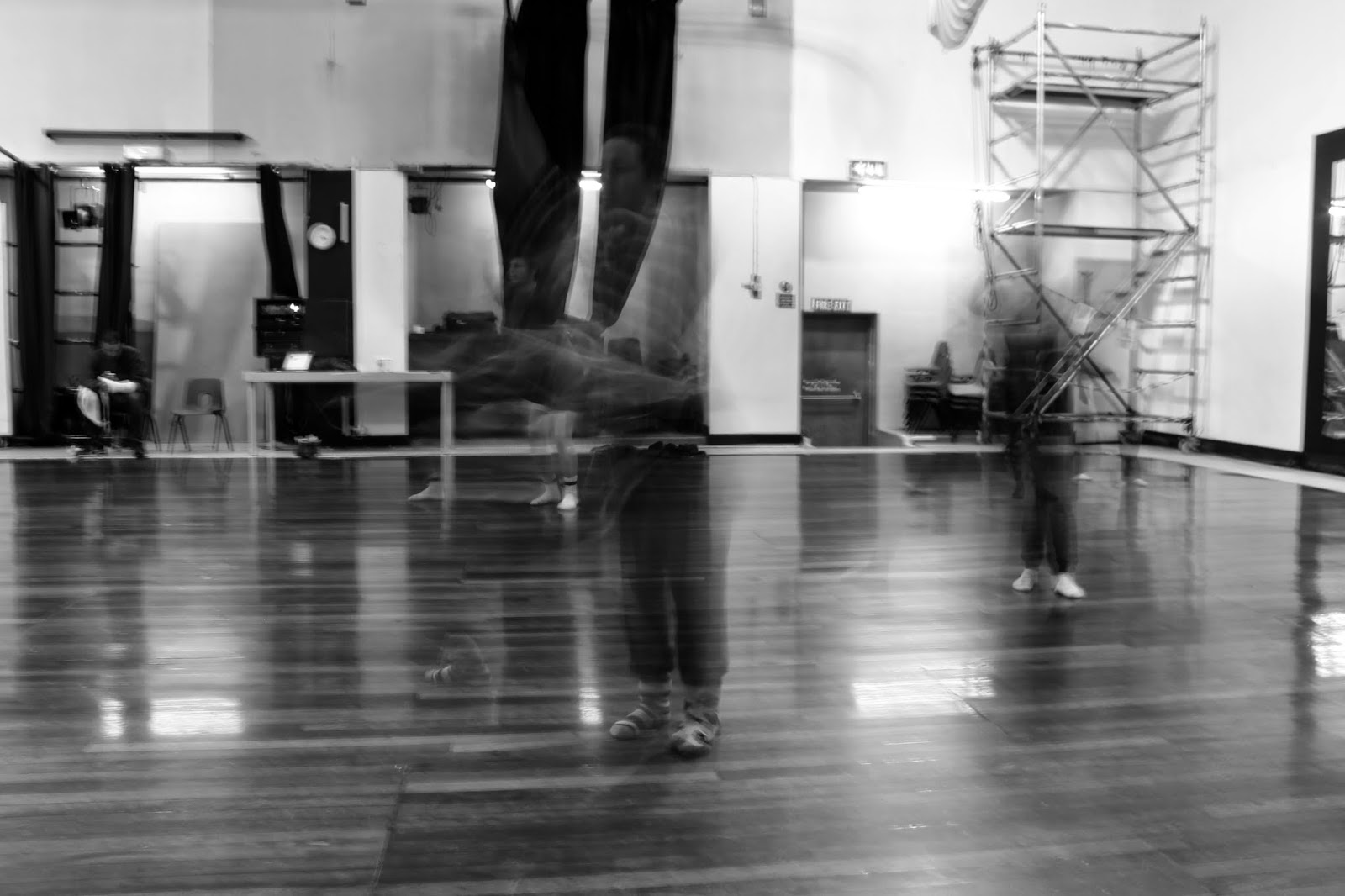
Dance
For this shoot we went to Bristol Community Dance Centre which is down the road from the college. We had to take pictures of the dancers whilst they were dancing. I used different shutter speeds in this shoot to create really still clear images and blurry images which show the dancers movement.


Edited Photos


Monday 10th November 2014
Iconic Photos
For my iconic photos I chose to focus on the idea of 1940's/1950's models and pin up girls.
I especially liked the work of Gil Elvgren, a famous pin up artist.

Elizabeth Taylor in 1950, photographer unknown

"The Ballerina Shoot"
Marilyn Monroe in 1954, by Milton H. Greene

"Breakfast at Tiffany's"
Audrey Hepburn in 1961, by Bud Fraker
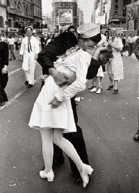
"V-J Day in Times Square"
1945, by Alfred Eisenstaedt

"Screen Album Magazine"
Judy Garland in Winter 1944, photographer unknown

"We Can Do It!"
Wartime propaganda poster, 1943 by J. Howard Miller
Gil Elvgren

"Help Wanted"

"Beautiful Lady"


For my photoshoot I am going to recreate a number of Gil Elvgren's photos, but with my own twist added in. I will use hair, makeup and costume to make my model look like a pin up doll to then recreate these images, although my pictures will be a lot less raunchy and more covered up.
10th December 2014
Pin Up Photoshoot
Contact Sheet:

Contact Sheet:


For this shoot I took photos of my friend with her hair in victory rolls with curls, red lipstick and a 1950's style head tie. I also decorated my room in 1950's style to create an effective background. I'm very happy with how these pictures turned out and how successful they are. I edited all of these images in Photoshop to make them look really vintage and this worked really well.
Final Image:
Final Image:

I chose this image for my final piece because this is my most effective and successful image from the shoot. I edited this picture in photoshop to make look a lot more old fashioned/vintage and I think I did this really well.
Evaluation:
The theme for this project was iconic images. I think my choice for what type of images I wanted to create was a really good choice. At first I really struggled to find effective ideas for this project but once I started thinking of ideas they kept flowing. I looked at the work of Gil Elvgren for this project as I really enjoy his work and think he's a great artist. I also really enjoy vintage art. I'm really happy with how this shoot turned out, I think I planned it really well and also managed my time really well, a lot better than other projects. I love this style of art and would be happy to work on images like this in the future. I'm very pleased with my final outcome.
No comments:
Post a Comment