Mini project: trainers
Wednesday 10th September 2014
Planning:


The above pictures are brain storms I created. The first brainstorm is everything I would want my trainers to have/look like if I were to buy some and the second brainstorm is the plan of my photo-shoot.
Below is a mood board I created of pictures in the style I wanted my pictures to look similar to.
I liked the style of these pictures as the backgrounds of most of these pictures are very plain which draws your attention to the trainers only.

The brief for this mini project was to plan and shoot images that promote a new trainer aimed at 16-21 year olds. The images I have taken and also the trainers I used were both what I thought would appeal to the 16-21 year old market. I wanted to keep the photos simple but bold with a plain background so the focus isn't taken away from the shoes. I'm happy with how these pictures turned out, I like the composition of them and the simplicity but boldness of the pictures.


The two photos below are the photos I chose as my final pieces. They're my favorite because in my opinion they have the best compositions and lighting out of the others. With both pictures I took them into Photoshop and adjusted the brightness, contrast and levels to achieve the look I was looking for.


Evaluation:
I enjoyed taking the pictures for this project as I could play around with aperture to create
different effects. I'm happy with the way my pictures turned out and would like to use aperture in the same way in the future to achieve the same outcome.
Mini Project: Selfies
Tuesday 16th September 2014
For the this mini brief we were asked to take 3 selfies. One funny photo, one sad photo and one photo with a stranger. At first I really didn't like the idea of having to take pictures of myself and uploading them to a college based blog but I knew I had to approach the task maturely and reasonably.
Funny Selfie

Sad Selfie

Selfie with a stranger

Evaluation:
I really didn't enjoy this project and I'm not happy with how my pictures came out, I really didn't like the idea of having to take a picture of myself which I see as quite personal and have to upload it to a college blog which is very public. If I had to do this again I would put a lot more planning into it to create better pictures.
Matching Shapes
Squares
Below are 3 images I took in my home based on squares, I had difficulty finding squares in my home that were interesting subjects.
I liked the composition and focus of this picture, I used the flash on my camera to give more lighting to the subject because I didn't like the lighting in the room.

I like the focus of this image and the composition, I like how the garden furniture in the background gives the photo some life, instead of a plain boring background which would make the image quite dull and lifeless.

I really like how the squares in this photo are on an angle compared to the other 2 images where the squares are upwards and clear to see, I think this makes the image more interesting and gives it a better composition.


Below is a pile of CD's I arranged to show the colors and lighting in them, I really like how the colors stand out against the plain background and I think this is a really effective image.

Below is a pile of sequins and some sewing thread I arranged to create an interesting composition, I specifically chose bright colours to stand out against the boring table and also the middle sewing thread which is also a boring color.


I didn't use a very interesting angle for this photo, but I really liked the lighting, colors and tone in the image so I thought I'd add it to my blog anyway.

For this image I was stood on a chair looking down on my subject, this makes the subject appear weak and vulnerable. I think the lighting in this photo is way too bright so I should've changed my camera to a smaller ISO, but I like the colors and tone in the image.


Again I didn't like the lighting or composition of this photo.

I like the lighting and composition of this photo but I don't like the focus.


Evaluation:


This image failed because I don't feel their are enough light trails in the frame,
the background is also blurry.


I like how in this image the background is very clear and colourful and I've
thought about my composition and framing. The only thing I dislike about this image
is that I don't think there's enough light trails.


I really like the lighting and composition of this image, the image has gloomy lighting and the look on the subjects face also gives the image a gloomy mood.


I chose to make this image black and white because I didn't like the colours of the image, I also changed the brightness and tone so you could see the subjects face more clearly.


I like the focus of this image and the composition, I like how the garden furniture in the background gives the photo some life, instead of a plain boring background which would make the image quite dull and lifeless.
I really like how the squares in this photo are on an angle compared to the other 2 images where the squares are upwards and clear to see, I think this makes the image more interesting and gives it a better composition.
Circles
Below are images of circles in my home, I preferred taking photos of circles rather than squares because the circles I found or created in my home were a lot more interesting than the squares and I could play around more with the compositions and lighting.
This is my favourite image out of the photos I took of circles, I really like how the light reflects off of the bubbles and shows different colors and tone in them. I don't like how the background is busy which takes your eyes away from the subject but I still think it's an effective and well planned photo.
Below is a pile of CD's I arranged to show the colors and lighting in them, I really like how the colors stand out against the plain background and I think this is a really effective image.
Below is a pile of sequins and some sewing thread I arranged to create an interesting composition, I specifically chose bright colours to stand out against the boring table and also the middle sewing thread which is also a boring color.
Below are 2 images of fruit that I took a few months ago in my home, I didn't take them for this project but after I found them on my laptop I realised they fit in well with the project brief so I thought I'd add them to my blog just to show how shapes are an important part of our everyday lives.
Evaluation:At first I didn't like this project because I found it very difficult to find shapes with interesting subjects in my home, and I thought my pictures were going to be very bad. Once I got into the project and realised shapes are all around us everyday I started to enjoy it a bit more and found some interesting subjects involving the shapes. I'm really pleased with how my circle images came out but not so pleased with my square images, this is because I think my circle images are a lot more interesting than my square images. If I had to do this project again I would put more planning into it and venture away from home so I could find a bigger variety of subjects.
Changing Your Photographic Angle
Our brief for this mini project was to take photos from unusual angles, for instance instead of standing right in front of your subject at eye level, move very high and look down on them or move very low and look up at them.
For this photo I sat on the floor and looked up on my subject, this gives the image a very tense atmosphere and makes the subject look very strong and powerful. I like the composition of this photo as the plain background draws your eyes to the main subject, I also like how color of the subjects long hair stands out against the color of the background.
I didn't use a very interesting angle for this photo, but I really liked the lighting, colors and tone in the image so I thought I'd add it to my blog anyway.
For this image I was stood on a chair looking down on my subject, this makes the subject appear weak and vulnerable. I think the lighting in this photo is way too bright so I should've changed my camera to a smaller ISO, but I like the colors and tone in the image.
The 2 collages below show the original images and the edited versions.
Rejected Images:
Evaluation:
I'm partially pleased with how my images came out but I know that I could've done a lot better. My images are all quite plain and boring and I should've put a lot more planning into the subject, I think this is because I rushed myself. If I had to do this project again I would definitely spend more time planning so I could create some really good and interesting photos.
Last 7 Days
For this mini project our brief was to take one photo every day for a week, below are my images.
Day 1
Day 2
Day 3
Day 4
Day 5
Day 6

Day 7

Evaluation:
At first I really liked the idea of this project because I had a lot of freedom with it, I could take a picture of whatever I wanted which was something to do with what I was doing that day. After the first 2 images I really started to dislike the project, this is because I kept forgetting to take a picture everyday and also because I struggled to find something interesting to take a picture of. I'm happy with some of my images but also really unhappy with a few of them. If I had to do this project again I would definitely have to remember to take them, and also find something more interesting to take a picture of each day.
Unusual Portraits
Our assignment for this mini project was to create an unusual portrait, we could do this by choosing an unusual location or dressing our subject up in unusual clothing or giving them an unusual prop.
Below are 2 mood boards I made to show what type of pictures I thought were unusual and I'd possibly like to take inspiration from.
The first mood board are pictures with unusual lighting, angles, compositions and just generally unusual pictures I found on the internet which I liked.
The second mood board I created was based on horror, I chose this theme because it's October which means Halloween is around the corner and this would be a fun and interesting theme to play around with.
Rejected Photos:
I didn't like this photo because I didn't like the composition or the lighting.
Again I didn't like the lighting or composition of this photo.
I like the lighting and composition of this photo but I don't like the focus.
Best Images:
I really liked the idea of this project as I always enjoy making portraits weird and unusual. I'm pleased with my photos but I know I could've done a lot better with the right person and the right props. The problem is finding someone who will allow me to take photos of them and feel comfortable doing so. Although my subject wasn't happy with me taking photos of them and also not happy with me experimenting with props and makeup/dressing up, I managed to get some shots which were slightly unusual. If I had to do this project again I would definitely try to find someone else who would allow me to take photos of them and feel comfortable, but also let me experiment with makeup, dressing up and props.
Tuesday 11th November 2014
Long Exposure/Shutter Speed
Thinking of using time in this project made me think of using shutter speed for my second shoot. I decided for my second photoshoot I would take a range of different photos in different locations because this fits in with time and the photos turn out really beautiful if done right. Below is a mood board I created showing what type of photos I wanted to achieve.
For this mini project we had to use long exposure to create light trails. I chose to set my tripod up at night time to capture the passing vehicles because I think this looks really effective.
Failed images:

This picture failed because you can see camera shake, both the
light trails and background are very blurry.

This image failed because I don't feel their are enough light trails in the frame,
the background is also blurry.

I actually really like the light trails in this image and think they're very effective,
although the background isn't in focus enough so this image failed for me.
Best Images:

I edited this photo to enhance the highlights and also darken the shadowed areas,
I think this made the image a lot more effective and it looks a lot better.
I really like the light trails in this image and also how clear the background
is at the same time.

This is my favourite image out of my best images, I really like the different
colours in the light trails. I also like how the background is very clear at the same time.
I edited this photo to enhance the colours and highlights in the light trails.

I like how in this image the background is very clear and colourful and I've
thought about my composition and framing. The only thing I dislike about this image
is that I don't think there's enough light trails.


I chose to make this image black and white because I didn't like the colours
in the original image. I think the image looks much better in black and white
and it also makes the light trails stand out much more.
Evaluation:
I really enjoyed this mini project and I'm also really happy with how my images turned out. If I did this project again I would go out on a less windy night, this is because the weather made my tripod slightly shake and some of the images were unsuccessful. Apart from that I'm happy with my outcome and would enjoy to do more work on this in the future.
Single Light Portrait
Below is a mood board I created to show what type of images I wanted to recreate.
I wanted my images to have a black background with just the subjects face lit up
as I really liked the way this looks.

Shoot One
For this shoot I used a black backdrop in a dark room and my subject held a torch to their face from the side so their face was the only thing lit up in the images.
Failed Images:


Both of these images failed because they're way too dark. You can only slightly see the subjects face but it's not fully lit up.
Best Images:

I really like the lighting and composition of this image, the image has gloomy lighting and the look on the subjects face also gives the image a gloomy mood.

This is my favourite image from the shoot, I chose to make this image black and white and also change the tone in the image to make it look more professional. The look on the subjects face gives the image a really cheerful mood.
Shoot 2
Failed Images:
For this shoot I chose to place my subject in front of a television in a dark room so just the light from the television lit up her face. This shoot wasn't as good or effective as my first single light shoot but it was good for experimenting with different lighting techniques.
Both of these images failed because they were far too dark to see the subjects face. I should've used a tripod and a higher ISO or used a different source of light.
Best Images:
I chose to make this image black and white because I didn't like the colours of the image, I also changed the brightness and tone so you could see the subjects face more clearly.
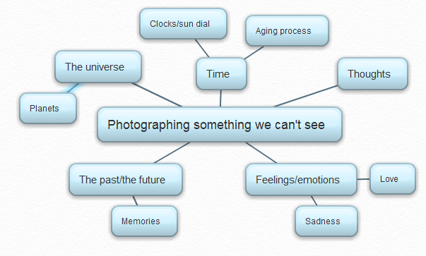
Photographing Something We Can't See
Below is a mind map and mood board of my ideas for this shoot. At first I really struggled to find ideas for this mini project but once I started writing down my ideas they kept flowing.
I chose to use the concept of time for my shoot because we can't see time.
Poem Pictures Mini Project
For this mini project we had to find a poem and take a photo which matches one line of the poem.
I chose a christmas poem because it's December and at the moment I have Christmas decorations up in my home.
"From home to home and heart to heart, from one place to another the warmth and joy of Christmas brings us closer to eachother." - Emily Matthews.
Below is a small collage of some of the photos I took for this project. I chose to take pictures of the decorations in my home to match the Christmas poem. I put my camera on a tripod, put it on manual focus and then took a few different shots, creating both in focus and out of focus images.
This image is in focus, you can see everything in the frame really clearly. This isn't my final image, I really like everything about this image but I didn't realise that you can see myself in the mirror, which ruins the image.
This is my favourite image out of the shots I took, I used manual focus to make the image out of focus so you can just see the outline of the tree, the colours and also the fairy lights, but not every detail like the other images. I really like the effect this gives the image.
I like how you can see every detail in this image and how the tree appears to be glowing.
The Subjective Approach
Animals Mini Project
For this mini project we had to take pictures in the theme of animals, but without any animals actually in the image. Below is a small collage of the images I took for this shoot.
I didn't want to travel far to take images for this shoot, and I have a pet rabbit in my home so decided I'd base my photoshoot on him.
For the first shoot I took photos of animal food, below is my best image from this shoot. I used white paper as a backdrop for these images.

For the second shoot I took photos of my pet rabbits cage. My rabbit was in the cage at the time, so I set my camera up on a tripod and used a slow shutter speed. I did this because this would allow my rabbit to run around the hutch, which then would eliminate movement (the rabbit) from the photo. I also chose to make the image black and white and change the tone to make it look more professional.

Dragons Den
Durex Ad
Chlamydia, Herpes, Genital Herpes and Aids are all sexually transmitted diseases and the Durex brand have to find a way of getting these unpleasant words and symptoms across to the public to adveritse their condoms. There is a thin line between fun, humour, irony and upsetting people whilst creating and transmitting ads.
Durex Youtube Ads
https://www.youtube.com/watch?v=efRGjRMwagA
https://www.youtube.com/watch?v=Z9YIaY6RlGw
Durex Youtube Ads
https://www.youtube.com/watch?v=efRGjRMwagA
https://www.youtube.com/watch?v=Z9YIaY6RlGw

This was our mind map of ideas for the Durex advert. We wanted our advert to be funny but also serious and not hurtful or offensive in any way. Our advert will be advertised as a poster, and our target audience for this advert was teenagers/young adults. Our reason for this is because of the significant increase in teen pregnancies and also teens with STI's over the last few years.

For our final idea we chose to create a poster which included the word Chlamydia with arms and legs, and the sentence "Nobody wants to be a walking STI." across the top. We chose this idea because we though it was very original and slightly humorous but still serious and gets the point across.

This is the first digitally made poster I created. I liked the hand drawn poster we made in group discussion but I wanted my digital poster to look more professional and serious. I added muscly arms as well as legs to the word "Chlamydia".
Final Outcome:

This is the second digitally made poster I created. I decided to add clip art of people whispering and looking in Chlamydia's direction. I thought this was effective as no young person wants to be whispered about or spoke about badly without them knowing, and also shows that chlamydia is a very bad thing. This may make them think twice before not using protection.
Evaluation:
Personally I think this project went reasonably well. Our group discussed ideas sensibly and made some really good points. Our mind map and poster were both really clear in what was being advertised and also were neat not messy. I'm really happy with my final outcome and think it's displayed really clearly but also sensibly.
Personally I think this project went reasonably well. Our group discussed ideas sensibly and made some really good points. Our mind map and poster were both really clear in what was being advertised and also were neat not messy. I'm really happy with my final outcome and think it's displayed really clearly but also sensibly.
No comments:
Post a Comment