Working with Photoshop
Wednesday 3rd September 2014
For the first lesson of image manipulation we learnt basic techniques we can use on photoshop, our first task was to use images of fruit on photoshop to create a face, mainly using the magic want tool and moving tool.

Our second task was to use photoshop to place one image on top of another and create depth of field to make the image look real. We had to move the scarecrow onto the photo of the house using the techniques we'd learned in the first task, then had to use a lens blur filter and an inner glow to blend the pictures together and make them look realistic.

Monday 15th September 2014
Our first task was based on color correction. We had to take an image where the lighting and color was bland and boring and make it brighter and bolder using the RGB settings.


Our second task was to find a black and white image from the internet and make layer masks to add color to the photo, whilst leaving most of the image black and white.


Monday 22nd September 2014
Masking Layers
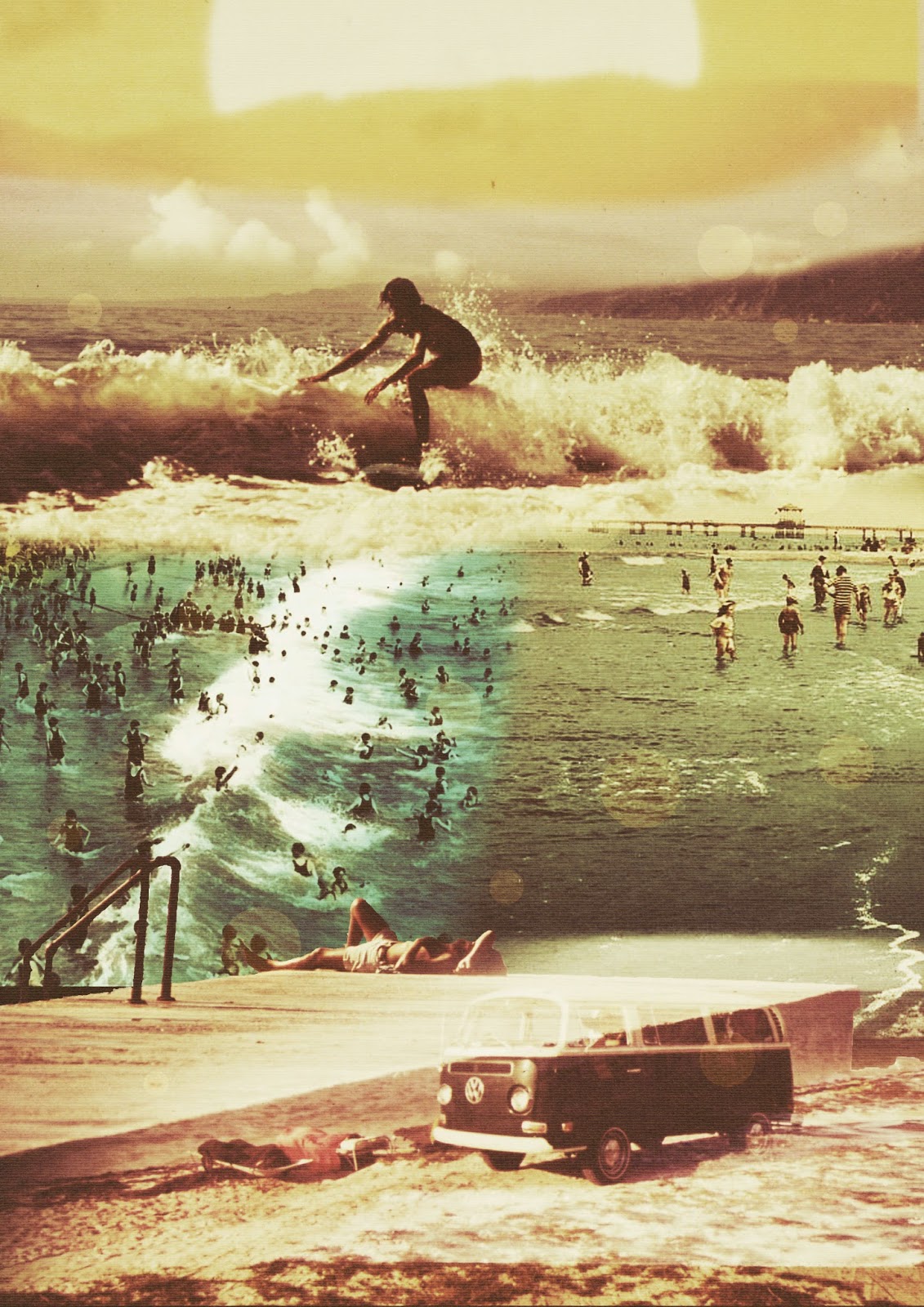
Our first task was to use the blending tool to make 3/4 pictures into one, resulting in an advertisement banner. I did this by adding a black background and using the gradient tool on the colour images to fade the outline of them to merge them together.
Below is a picture I created using the same techniques, but with pictures from the internet, creating a unique piece.

Task 2 was experimenting with the different layer blending tools. The image below is the end result of the different tools I used on different parts of the picture.

Monday 29th September 2014
The main task of todays lesson was to take all the techniques we've learnt in the past few weeks and use them all to create an image, we also learnt a new technique called colour matching. This was the end result of my work.

Below is an image I created using the same techniques but with pictures from the internet.

Our next task was to create a collage of a bird hotel, using the cutting tool and different blending effects. Below is my final outcome.

Monday 20th October 2014
Society 6 Research

I really like this image of the world map but with patterns in every country, I find it really interesting and you can tell the artist has really put thought into this work.

I really like this image of a gramophone as it's similar to the first image, and also because I'm really into vintage/retro objects. I like that the bright patterns stand out against the plain background, and also that even though the patterns are all different, they don't clash.

I'm not too fond of this image because it's just lines on a canvas, there's no meaning to the image. Although I do like the colours on this image, they give a happy vibe.

I like that this image is black and white because you can see the details of the doodles more clearly, and I like this style of drawing. The only thing I think could improve this is if the sketches were slightly more spaced out, so you could see them more clearly.

I really like the simplicity to this image, it's very plain yet powerful. I like that the arrows are different lengths instead of all the same length, and also how the colours stand out against the plain white background.

I really like this image and it caught my eye because daisies are my favourite flowers, this collage also reminds me of some of my own photographs of daisies. I like that each individual image has a different composition and contrast/colour, because it makes the collage look slightly abstract but really effective.
Skin Tutorial
For this task we were asked to design a skin textured typography scene, we had to include a background using a texture to create a good effect. We also had to add text which had to be filled in with the texture of skin.


Leaf Collage
For this task we had to use leaves and a textured background to create a leaf collage.


Autumn Collages


David Hockney's Collages


My David Hockney Inspired Work


Face Re-touch
For my face re-touch I chose this image of my sister from my studio techniques work.

Development Through Photoshop
I started off by selecting the healing brush tool as shown on the left hand side, and I made sure that "spot healing brush tool" was selected. I then clicked on any spots/blemishes on model's face until I was happy with the result.

Next, I selected the patch tool as shown in the first image below. Using the patch tool, I drew a closed loop around the clearer area under the eye that I wanted to retouch.

When the loop was selected and surrounded by a dash line, I clicked inside of it and held the mouse button down, and dragged the loop onto the dark circle right underneath the eye. This instantly smoothed out lines/blemishes and corrected the colour of dark circles.

I found it very difficult to fix the models eyebrows, so instead I decided to completely erase the eyebrows again using the patch tool, then creating a custom brush in the shape of an eyebrow to add to her face.

To make my eyebrow brush, I got this eyebrow image from the internet and opened it in Photoshop. Using Polygonal Lasso Tool, I drew around the eyebrow I wanted, then went to Edit > Define Brush Preset then pressed ok. To create a symmetrical eyebrow, I flipped the image horizontally then did the same technique.


I also chose to do this to the model's eyelashes, this is the result.

Lastly, I sharpened some areas of the model such as her eyes, and blurred areas such as her eyebrows and eyelashes. I chose to make this image black and white as I think it looks more realistic this way, and also changed the levels.

This is my final outcome for my face retouch. I have mixed feelings about this, I like some of the techniques I used to create this but I don't think it looks very realistic. I still think I worked well on this and learned new techniques and processes on photoshop.

Dom Barnes Research

Dom Barnes is an amateur photographer/blogger currently living in Birmingham.

"Untitled" September 30th 2012
Apple iPhone 4S
Aperture: F/2.4
Shutter Speed: 1/5025
ISO: 50

"Untitled" January 5th 2013
iPhone 4S
Aperture: F/2.4
Shutter Speed: 1/15
ISO: 800
ISO: 800

"Park Hill Road" November 12th 2011
Canon EOS 400D Digital
Aperture: F/3.5
Shutter Speed: 1/40
ISO: 200
ISO: 200
The images above that I've shown are what I consider Dom's best photos, however I would not call him a photographer, more of a blogger. His photos are not of photography standard, they're more of just a documentation of his everyday life. Having said that, I do like some of his photos from Flickr.
Final Project; Flower Collage
Research Images
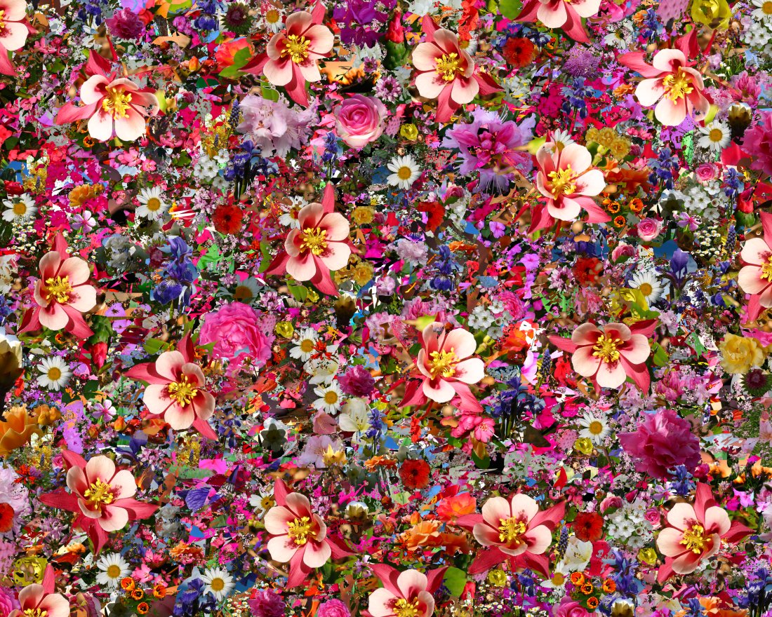
I like the really busy vibe to this colourful collage, although I think it's slightly too busy and the contrast is too high. I also think a collage this busy would be difficult to recreate.
This isn't a computer generated collage, someone has placed flowers this way to create a collage. I like this because they have put more thought into the collage than they would using Photoshop, and there's a wide range of flowers here.

This collage consists of patterns instead of flowers, but the actual shape of the collage is a flower and I thought I'd add this to think outside of the box. I like the colours and patterns here.
This collage is a drawing not photographs, but I like the colours and consistency of the collage. I'd like to use this collage as inspiration for my own.

I really like how the creator of this collage has placed a patterned background behind the flowers, I think this makes it much more visually appealing than it would be with a plain background. I also really like the colour scheme to this collage and I'd like to use this as inspiration for my own.

I don't like this collage as I think it's slightly too busy and the flowers aren't placed very well or thoughtfully, it looks as if the creator has just placed the flowers at random. I still added this to my research to show what I don't want my collage to look like.

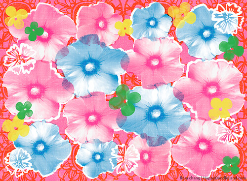
I like that this image is a lot simpler but I think it's slightly too plain. It would look much better with maybe a patterned background, although I like the colour scheme and symmetry of this collage.

I really like the colour scheme and consistency of this collage, although I think there are slightly too many squares for how small the images are.

I really like this collage because the background (Twiggy) makes it much more interesting and unique. I'd like to use this as inspiration for my own collage.

Again I like this collage because the background makes it much more interesting and unique, I like that the flowers are the only coloured part of the collage because this stands out.

I find this collage rather creepy because of the eyes in the flowers, but I also find it very interesting and diverse. I'd like to experiment with my images to create something similar.

I like that this collage consists of writing and other images as well as flowers, this gives the collage a scrapbook feel. I'd like to experiment with Photoshop to create something similar.
Contact Sheet
For my flower shoot I decided to go to B&Q garden centre to take photos, this is because there aren't many flowers in my garden or around my area, and B&Q has a great garden with a large variety of flowers.

Edited Images

Shutter Speed: 1/200
Aperture: F9.0
ISO: 100

Shutter Speed: 1/200
Aperture: F8.0
ISO: 100

Shutter Speed: 1/125
Aperture: F7.1
ISO: 100

Shutter Speed: 1/160
Aperture: F8.0
ISO: 100

Shutter Speed: 1/60
Aperture: F5.6
ISO: 400
Practice Collages

This is my first practice collage, all I did for this collage was set a texture as the background and use the quick selection tool to select my flowers, then moved them around and changed the size of them until I was happy. I like the way the flowers are laid out but I didn't think it was very creative and didn't show my full ability to use Photoshop.

I think this collage is slightly better because it's symmetrical and this looks more effective, I also added a Bokeh effect because I think this looks really girly and pretty. I like the colour theme to this collage and the way the flowers are arranged.

I decided to spread the flowers out a bit more on this collage and also add mainly smaller flowers instead of large flowers, I think this looks really effective and I like the colour scheme and Bokeh effect. This all gives the collage a really happy vibe.

I decided to do something a bit different and unusual for this collage, so I used the lips from "The Rocky Horror Picture Show" and added them to all the middle of the daisies. I changed the sizes of them to fit the flowers and also erased some parts so it would look realistic.
Collage Tutorial

First I opened the sky file, so this would be my main background.

I then added the text and changed the font and size until I was happy with how it looked.

Next I opened the daisy image and used the quick selection tool to select which daisy I wanted, then copied and pasted it onto my background.

I used the polygonal lasso tool to get rid of the part of the daisy I didn't want on my image.

I then kept copying and pasting flowers and rearranging them until I was happy with what they looked like.

This is the final outcome.
Final Collage

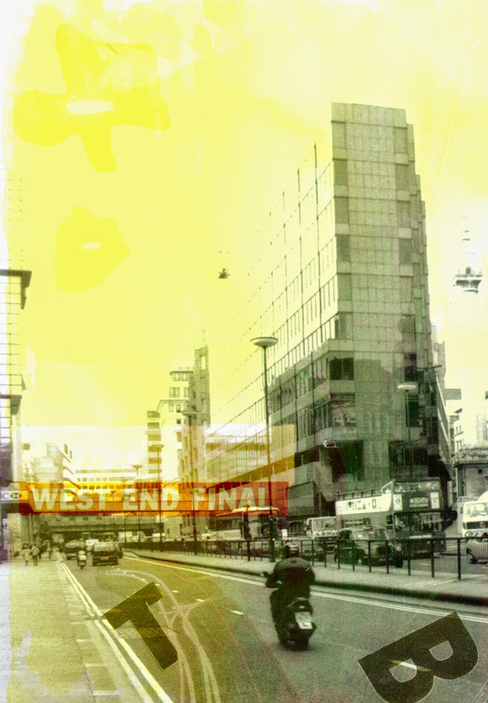
This is my final outcome for this assignment. For this collage I decided to do something a little bit different, so instead of setting a texture as the background I set a picture of the sky, clouds and a city below as the background. I liked the sky image because it was slightly gloomy which is what I was going for. I also decided to add the text in the middle, it's a quote I found online which I thought fitted in well with the flower theme.
Evaluation:
I think I've worked really well on this assignment and especially well on my practice collages and my research. I didn't manage my time very well but that's something I can work on, overall I have really enjoyed every part of this assignment especially the shoot and creating the collages, and I'm very happy with my final outcome.
Stress City
No comments:
Post a Comment