Andreas Gursky
Born:
January 15th 1955 (age 59)
Andreas Gursky is a German photographer and
professor at the Kunstakademie Dusseldorf, Germany. He is known for his large
format architecture and landscape colour photographs, often employing a high
point of view. Before the 1990’s, Gursky didn’t digitally
manipulate his images. In the years since, Gursky has been frank about his
reliance on computers to edit and enhance his pictures, creating an art of
spaces larger than the subjects photographed. I
really like how colourful Gursky’s work is and I really like the ‘busy’ vibe
most of his images have. Even though his pictures are all mainly very busy he
has still thought about his compositions and framing.
"I am never interested in the individual, but in the human species and its environment."
“My preference for clear
structures is the result of my desire - perhaps illusory - to keep track of
things and maintain my grip on the world.”
I like that Gursky portrays modern life in photographs that are colourful and have a busy vibe.
Martin Parr
Born: 23rd May 1952 (age 62); Epsom
Martin Parr is a British documentary photographer, photojournalist and photobook collector. He is known for his projects that take an intimate look at aspects of modern life, in particular documenting the social classes of England, and more broadly the wealth of the Western world.
His major projects have been:
Rural Communities (1975-82)
The Last Resort (1983-85)
The Cost of Living (1987-89)
Small World (1987-94)
and
Common Sense (1995-99).
"Photography is the simplest thing in the world, but it is incredibly complicated to make it really work."
"Fashion pictures show people looking glamorous. Travel pictures show a place looking at its best, nothing to do with the reality. In the cookery pages, the food always looks amazing, right? Most of the pictures we consume are propaganda."
I really like Parr's work because his work is original and unique, but also has a more laid back and comfortable feel.
Garry Winogrand
Born: 14th January 1928; the Bronx, New York
Died: 19th March 1984 (aged 56)
Garry Winogrand was a street photographer known for his portrayal of American life and its social issues in the mid-20th century. Though he photographed Los Angeles and elsewhere, Winogrand was essentially a New York photographer. He published four books during his lifetime and was one of three photographers featured in the influential New Documents exhibition at Museum of Modern Art in New York in 1967. He also had solo exhibitions there in 1969, 1977 and 1988. Winogrand supported himself by working as a freelance photojournalist and advertising photographer in the 1950s and 1960s, and taught photography in the 1970s.
Phil Coomes, writing for BBC News in 2013 said "For those of us interested in street photography there are a few names that stand out and one of those is Garry Winogrand, whose pictures of New York in the 1960s are a photographic lesson in every frame."
At the time of Winogrand's death his late work remained undeveloped, with about 2,500 rolls of undeveloped film, 6,500 rolls of developed but not proofed exposures, and about 3,000 rolls only realised as far as contact sheets being made.
"There is nothing as mysterious as a fact clearly described I like to think of photographing as a two way act of respect. Respect for the medium, by letting it do what it does best, describe. And respect for the subject, by describing it as it is. A photograph must be responsible to both."
"Photography is not about the thing photographed. It is about how that thing looks photographed."
I really like the vintage feel of Winogrand's work, and I also like that most of his work is in black and white. I think working in black and white makes his work more authentic and doesn't distract like colour does.
Henri Cartier-Bresson
Born: August 22nd 1908; Chanteloup-en-Brie, France
Died: August 3rd 2004 (aged 95); Montjustin, France
Henri Cartier-Bresson was a French photographer considered to be the father of photojournalism. He was the master of candid photography and an early user of 35mm film. He helped develop the street photography or life reportage style, and coined the term 'The Decisive Moment' that has inspired generations of photographers ever since. Cartier-Bresson developed a strong fascination with painting early on, particularly with surrealism. In 1932 after spending a year in the Ivory Coast, he discovered the Leica - his camera of choice thereafter, and began a life long passion for photography. In 1933 he had his first exhibition at the Julien Levy Gallery in New York. He later made films with Jean Renoir.
In 1947 with Robert Capa, George Rodger, David Seymour and William Vandivert, he founded Magnum Photos. After three years travelling in the East, in 1952 he returned to Europe where he published his first book, "Images a la Sauvette" (published in English as The Decisive Moment).
"Your first 10,000 photographs are your worst."
"For me, the camera is a sketch book, an instrument of intuition and spontaneity."
I really enjoy Henri Cartier-Bresson's work and he's definitely one of my favourite street photographers. You can tell that he puts thought into the composition of each image, and I love that each of his photo's tells a story.
Cecil Beaton
Born: Cecil Walter Hardy Beaton - 14th January 1904; Hampstead, London
Died: 18th January 1980 (aged 76); Reddish House, Wiltshire
Cecil Beaton was an English fashion, portrait and war photographer, diarist, painter, interior designer and an Academy Award-winning stage and costume designer for films and the theatre. He was named to the International Best Dressed list hall of fame in 1970.
Beaton designed book jackets and costumes for charity matinees, learning the professional craft of photography at the studio of Paul Tanqueray, until Vogue took him on regularly in 1927. He also set up his own studio, and one of his earliest clients was Stephen Tennant.
His first camera was a Kodak 3A folding camera. Over the course of his career, he employed both large format cameras, and smaller Rolleiflex cameras. Beaton is best known for his fashion photographs and society portaits, he worked as a staff photographer for Vanity Fair and Vogue in addition to photographing celebrities in Hollywood. He was fired from Vogue in 1938 for inserting some tiny but still legible anti-semitic phrases into American Vogue at the side of an illustration about New York society, the issue was recalled and reprinted at vast expense. Beaton returned to England, where the Queen recommended him to the Ministry of Information. He became one of Britain's leading war photographers, best known for his images of the damage done by the German blitz. His career was restored by the war.
"All I want is the best of everything and there's very little of that left."
"Perhaps the world's second worst crime is boredom; the first is being a bore."
David Hockney
Born: 9th July 1937 (age 77); Bradford
David Hockney is an English painter, draughtsman, printmaker, stage designer and photographer. He lives in Bridlington, East Riding of Yorkshire, and Kensington, London. Hockney maintains two residences in California, where he lived on and off for over 30 years.
He's an important contributor to the pop art movement of the 1960's and is considered one of the most influential British artists of the 20th century. Hockney painted portraits at different periods in his career. From 1968, and for the next few years he painted friends, lovers, and relatives just under lifesize and in pictures that depicted good likenesses of his subjects.
"The moment you cheat for the sake of beauty, you know you're an artist."
"Drawing is rather like playing chess: your mind races ahead of the moves that you eventually make."
I really enjoy Hockney's Cubism work and I like that it's colourful and bold. I think some of his compositions are slightly too busy and distracting but the less busy pieces are really effective.
Richard Avedon
Born: May 15th 1923; New York
Died: October 1st 2004 (aged 81); San Antonio, Texas
Richard Avedon was an American fashion and portrait photographer. An obituary published in The New York Times said that "his fashion and portrait photographs helped define America's image of style, beauty and culture for the last half century". In 1944, Avedon began working as an advertising photographer for a department store, but was quickly endorsed by Alexey Brodovitch, the art director for the fashion magazine Harper's Bazaar. In 1945 his photographs began appearing in Junior Bazaar and a year later in Harper's Bazaar. In 1946 Avedon had set up his own studio and began providing images for magazines including Vogue and Life. He soon became the chief photographer for Harper's Bazaar. Avedon did not conform to the standard technique of taking studio fashion photographs, where models stood emotionless and seemingly indifferent to the camera. Instead, he showed models full of emotion, smiling, laughing and many times in action in outdoor settings which was revolutionary at the time. However, towards the end of the 1950's he became dissatisfied with daylight photography and open air locations and so turned to studio photography, using strobe lighting.
"My portraits are more about me than they are about the people I photograph."
"I hate cameras. They interfere, they're always in the way. I wish: if I could work with my eyes alone."
Horst P Horst
Born: Horst Paul Albert Bohrmann - August 14th 1906; Saxony-Anhalt, Germany
Died: November 18th 1999 (aged 93); Palm Beach Gardens, Florida
Horst Paul Albert Bohrmann who chose to be known as Horst P. Horst, was a German-American fashion photographer. He is best known for his photographs of women and fashion, but is also recognized for his photographs of interior architecture, still lifes, especially ones including plants, andenvironmental portraits. One of the great iconic photos of the 20th century is "The Mainbocher Corset" with its erotically charged mystery, captured by Horst in Vogue's Paris studio in 1939. His work frequently reflects his interest in surrealism and his regard of the ancient Greek ideal of physical beauty. His method of work typically entailed careful preparation for the shoot, with the lighting and studio props (of which he used many) arranged in advance. His instructions to models are remembered as being brief and to the point. His published work uses lighting to pick out the subject; he frequently used four spotlights, often one of them pointing down from the ceiling. While most of his work is in black and white, much of his colour photography includes largely monochromatic settings to set off a colourful fashion.
"I don't think photography has anything remotely to do with the brain. It has to do with eye appeal."
David Bailey
Born: 2nd January 1938; Leytonstone, London (age 77)
David Royston Bailey is an English fashion and portrait photographer. In 1959 he became a photographic assistant at the John French studio, and in May 1960 he was a photographer for John Cole's Studio Five, before being contracted as a fashion photographer for British Vogue magazine later that year. He also undertook a large amount of freelance work. Along with Terence Donovan and Brian Duffy, Bailey captured and helped create the 'Swinging London' of the 1960's: a culture of fashion and celebrity chic. The three photographers socialised with actors, musicians and royalty, and found themselves elevated to celebrity status.
"The only thing they can't teach you at art school is art."
"I have never met an ugly woman."
Robert Mapplethorpe
Born: November 4th 1946; Queens, New York
Died: March 9th 1989 (aged 42); Boston
Robert Mapplethorpe was an American photographer, known for his sometimes controversial large scale, highly stylized black and white photography. His work featured an array of subjects, including celebrity portraits, male and female nudes, self-portraits and still life images of flowers. His most controversial work is that of the underground bondage and sadomasochistic BDSM scene in the late 1960's and early 1970's of New York. Mapplethorpe worked primarily in a studio, and exclusively in black and white, with the exception of some of his later work and his final exhibit "New Colours". His body of work features a wide range of subjects, but his main focus and the greater part of his work is erotic imagery. He would refer to some of his own work as pornographic, with the aim of arousing the viewer, but which could also be regarded as high art. Other subjects included flowers, especially orchids and calla lilies, children, statues, and celebrities including Andy Warhol, Richard Gere, Peter Gabriel and Patti Smith.
"I never liked photography. Not for the sake of photography. I like the object. I like the photographs when you hold them in your hand."
"When I have sex with someone I forget who I am. For a minute I even forget I'm human. It's the same thing when I'm behind a camera. I forget I exist."
John Davies
Born: 1949 (age 66); County Durham, England
John Davies is a British landscape photographer. He is known for producing large photographic prints of images produced from high vantage points, using traditional darkroom techniques. His work in the 1980's primarily use medium format cameras, and work from the 1990's a large format camera, although in recent years he has begun using dSLR and digitial medium format cameras in his work as well. While his career began by producing traditional but masterful landscape images, he quickly progressed to composition where the natural environment was juxtaposed against industrial elements impinging on this.
Aaron Siskind
Born: December 4th 1903; New York City
Died: February 8th 1991 (aged 87); Providence, Rhode Island
Aaron Siskind was an American photographer widely considered to be closely involved with, if not a part of the abstract expressionist movement. In his autobiography he wrote that he began his foray into photography when he received a camera for a wedding gift and began taking pictures on his honeymoon. He quickly realized the artistic potential this offered.
Siskind's work focuses on the details of nature and architecture. He presents them as flat surfaces to create a new image out of them, which he claimed stands independent of the original subject. His work has been described as crossing the line between photography and painting.
"In any art, you don't know in advance what you want to say - it's revealed to you as you say it. That's the difference between art and illustration."
"We look at the world and see what we have learned to believe is there. We have been conditioned to expect... but, as photographers, we must learn to relax our beliefs."
Annie Leibovitz
Born: October 2nd 1949 (age 65); Connecticut, US
Anna-Lou "Annie" Leibovitz is an American portrait photographer. In 1970 she started her career as staff photographer working for just launched Rolling Stone magazine. In 1973, publisher Jann Wenner named Leibovitz chief photographer of Rolling Stone, a job she would hold for 10 years. She worked for the magazine until 1983, and her intimate photographs of celebrities helped define the Rolling Stone look. While working for Rolling Stone, Leibovitz became more aware of the other magazines and learned that she could work for magazines and still create personal work, which for her was the most important. She sought intimate moments with her subjects, who "open their hearts and souls and lives to you".
On December 8th 1980, Leibovitz had a photo shoot with John Lennon for Rolling Stone, and she promised him he would make the cover. She had initially tried to get a picture with just Lennon alone as Rolling Stone wanted, but Lennon insisted that both he and Yoko Ono be on the cover. Leibovitz then tried to recreate something like the kissing scene from the couple's Double Fantasy album cover, a picture Leibovitz loved, and she had John remove his clothes and curl up next to Yoko on the floor. Leibovitz was the last person to professionally photograph Lennon, he was shot and killed five hours later.
"One doesn't stop seeing. One doesn't stop framing. It doesn't turn off and turn on. It's on all the time."
"A thing that you see in my pictures is that I was not afraid to fall in love with these people."
Surrealism
Surrealism was officially launched as a movement with the publication of poet Andre Breton's first Manifesto of Surrealism in 1924. The surrealists saw the forces of reason blocking the access routes to the imagination. Their efforts to tap the creative powers of the unconscious set Breton and his companions on a path that carried them through the territory of dreams, intoxication, chance, sexual ecstasy and madness. Photography came to occupy a central role in Surrealist activity. In the works of Man Ray and MauriceTabard, the use of such procedures as double exposure, combination printing, montage, and solarization dramatically evoked the union of dream and reality.
Surrealist photographers:
Erik Johansson
Salvador Dali
Man Ray


Andre Kertesz

Born: 2nd July 1894; Budapest, Austria-Hungary
Died: 28th September 1985 (aged 91); New York
Andre Kertesz born Kertesz Andor, was a Hungarian photographer known for his groundbreaking contributions to photographic composition and the photo essay. Kertesz never felt that he had gained the worldwide recognition he deserved. Today he is considered one of the seminal figures of photojournalism. Known for his extended study of Washington Square Park and his distorted nudes of the 1930's, Kertesz was a quiet but important influence on the art of photography. Though he spent most of his life in the United States, his European modernist sensibility is what made him great, and that is what he is remembered for today.
"The most valuable things in life are a man's memories. And they are priceless."
"I do what I feel, that's all. I am an ordinary photographer working for his own pleasure. That's all I've ever done."
I really like that Kertesz's work is black and white because I find this more visually pleasing and I find that colour can be quite distracting. You can tell by his work that he really thinks about his compositions and vibes in each image. His work has definitely given me inspiration for my reflection shoot.
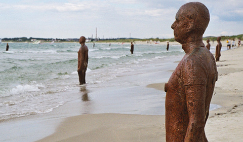
Antony Gormley
Sir Antony Mark David Gormley (born 30th August 1950) is a British sculptor. His best known works include the Angel of the North, a public sculpture in Gateshead in the North of England, commissioned in 1994 and erected in February 1998, Another Place on Crosby Beach near Liverpool and Event Horizon, a multi-part site installation which premiered in London in 2007, around Madison Square in New York City, in 2010 and in Sao Paulo in 2012.
"Iron Baby"
"Angel of the North"
"Exposure"
"Another Place"
Another Place consists of 100 cast-iron, life size figures spread out along three kilometres of the foreshore, stretching almost one kilometre out to sea. The Another Place figures - each one weighing 650 kilos - are made from casts of the artist's own body standing on the beach, all of them looking out to sea, staring at the horizon in silent expectation. Having previously been seen in Cuxhaven in Germany, Stavanger in Norway and De Panne in Belgium, "Another Place" is now a permanent feature in the UK, at Crosby Beach.
My Opinion:
Although I find a lot of Antony's work rather boring and not visually appealing, I really like his work "The Angel of the North" and "Another Place." I like The Angel of the North because of it's location and large size, you can see it as you drive along the A1. It's not something you'd expect to see as you're driving along the motorway, so it's very eye catching. It's size is very unexpected too, it makes it look like its name, it quite literally looks like an angel. I also like Another Place due to it's location and how many statues there are. No one goes to the beach expecting to see 100 cast-iron statues facing out to sea, so these are very shocking to see but also overwhelming. Overall I think Antony is a good artist, and you can tell he puts so much thought, time and effort into his work.
Tracey Emin
Tracey Emin (born 3rd July 1963) is an English artist. She is part of the group known as Britartists or YBAs (Young British Artists). Emin lives in Spitalfields, East London on Fournier Street in a Georgian Huguenot silk weaver's house which dates from 1726.
She is a panellist and speaker: she has lectured at the Victoria and Albert Museum in London, the European Graduate School in Saas-Fee, Switzerland, the Art Gallery of New South Wales in Sydney (2010), the Royal Academy of Arts (2008), and the Tate Britain in London (2005) about the links between creativity and autobiography, and the role of subjectivity and personal histories in constructing art. Emin's art takes many different forms of expression including needlework and sculpture, drawing, video and installation, photography and painting. In December 2011, she was appointed Professor of Drawing at the Royal Academy; with Fiona Rae, she is one of the first two female professors since the Academy was founded in 1768.
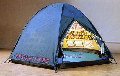
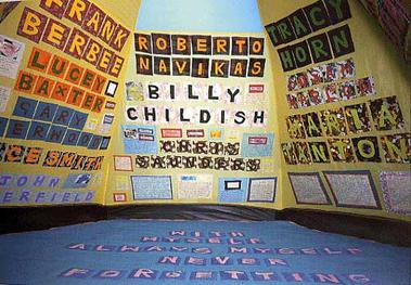
"Everyone I Have Ever Slept With"
"I Do Not Expect"
"F**k off and die you s**g"
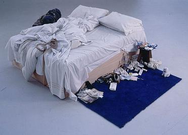
"Unmade Bed"
"My Bed" is a work by Tracey Emin. First created in 1998, it was exhibited at the Tate Gallery in 1999 as one of the shortlisted works for the Turner Prize. It consisted of her bed with bedroom objects in an abject state, and gained much media attention. Although it did not win the prize, its notoriety has persisted. The artwork generated considerable media furor, particularly over the fact that the bedsheets were stained with bodily secretions and the floor had items from the artist's room (such as condoms, a pair of knickers with menstrual period stains, other detritus, and functional, everyday objects, including a pair of slippers). The bed was presented in the state that Emin claimed it had been when she said she had not got up from it for several days due to suicidal depression brought on by relationship difficulties.
My Opinion:
I'm in love with all of Tracey Emin's work, I really like that her work is so straight forward but shocking in a way. Even in this day and age women are expected to come across polite, clean and ladylike, Tracey's work definitely goes against this but this is what I like. I've always believed that a woman should be able to be whoever she wants and act however she wants without being labled as unladylike, inappropriate or vulgar. I particularly like "Everyone I have ever slept with". The work quite literally means everyone she has ever slept with, although some not in a sexual sense.
"Some I'd had a shag with in bed or against a wall some I had just slept with, like my grandma. I used to lay in her bed and hold her hand. We used to listen to the radio together and nod off to sleep. You don't do that with someone you don't love and care about."
Although not all of the names in the tent are meant in a sexual sense, I'm glad that some are. It shows that sex isn't a subject Tracey is afraid to talk about, and I think that's really inspiring as sex is such a taboo subject in this day and age, when really it should be something everyone feels comfortable talking about. Overall I think Tracey Emin is an amazing and inspiring artist, she definitely gives off the impression that women should be who they want to be, and I think that's very important to lots of young women today.
Graffiti- Art or Vandalism?
Graffiti is writing or drawings that have been scribbled, scratched or sprayed illicitly on a wall or other surface, often in a public place. Graffiti writing is often seen as having become intertwined with hip hop culture and styles derived from New York Subway graffiti.
For Graffiti
- Graffiti can give a message
- Graffiti is art
- It's a way for artists to express their feelings and ideas freely
- It can improve the look of a boring area
- Graffiti attracts tourists from around the world
- Museums and art galleries are now placing graffiti in their buildings, and even holding graffiti exhibitions
- Creating art on buildings/walls instead of paper/canvas doesn't waste paper, therefore graffiti is more eco-friendly
Against Graffiti
- Costs time and money cleaning it up
- Affects shop/business owners who have to clean their properties
- Some graffiti isn't artistic, tagging is tasteless and ugly and ruins walls, parks and play equipment
- It's illegal (risk of being prosecuted)
- Some people graffiti explicit/inappropriate pictures/words on walls, which isn't nice for anyone to see, especially children
The images of graffiti below show what I feel is vandalism, not art. These aren't tasteful, they're just tags sprayed onto a wall for the sake of it. I believe that it is this kind of graffiti that gives people such a bad attitude towards street art and not the recognition it deserves.
The images of graffiti below is what I feel is art, not vandalism. These pieces of street art are so colourful and beautiful, and you can tell just by looking at them how much time and effort has been put into each spray-painting. They're all tasteful unlike tagging and I don't understand how anyone can dislike art like this and call it vandalism.
My personal opinion
I am very lucky to live in a city which is covered in graffiti, I think without graffiti everywhere the world would be a very boring place to live. As much as I love street art, I am glad it's illegal. I think it wouldn't be the same if it was legal, to me there's nothing more amazing than an artist risking their freedom to create such beautiful pieces of art for people to see. I think graffiti is needed for free expression, and to add a unique beauty to the boring industrial world. Also if graffiti was legal, then the world would be a complete mess and graffiti wouldn't be special anymore.
Gallery/Exhibition Reports
Wildlife Photographer of the Year
At Bristol Museum and Art Gallery
Now in its 50th year, the Wildlife Photographer of the Year competition provides a global showcase of the very best nature photography. The competition is co-owned by the two UK institutions that pride themselves on revealing and championing the diversity of life on Earth - the Natural History Museum and BBC Worldwide. There is a major exhibition at the Natural History Museum that tours worldwide throughout the year. The winning images appear on the Natural History Museum website, in BBC Wildlife Magazine and publications worldwide. As a result, the photographs are now seen by millions.
We visited the exhibition at Bristol Museum and Art Gallery on Friday 9th December 2014. Upon entering the exhibition I was surprised to see such bold and colourful images, I expected a room full of dull photos with nothing interesting to see. The room was completely white, which makes the photographs stand out and doesn't distract your attention from the subjects. The photographs fall into 11 different awards; Mammals, Birds, Amphibians and Reptiles, Invertebrates, Plants and Fungi, Underwater Species, Earth's Environments, Black and White, Natural Design, World in Our Hands and People's Choice. Below are a few of my personal favourites from the exhibition.
Grand Title Winner: "The Last Great Picture"
by Michael "Nick" Nichols
Canon EOS 5D Mark III + 24-70mm f2.8 lens at 32mm; 1/250 sec at f8; ISO 200.
I love the lighting and composition of this image, it definitely wouldn't have the same effect if it was in colour. The contrast between the sky and the sleeping lions is so effective, and the atmosphere/feel of the photograph is so mysterious but powerful.
"Intimacy" by Michael "Nick" Nichols, USA
Canon EOS 5D Mark III + 24mm f8 lens; 1/180 sec at f8; ISO 200; radio-controlled robot.
I really like the loving and touching feel to this photograph. I like how Nick shot the image in black and white to strip out detail and convey the intimacy of the moment.
"Natural Harmony" by Minghui Yuan, China
Nikon D3s + Tamron 90mm f2.8 lens; 1/640 sec at f4.5; ISO 400.
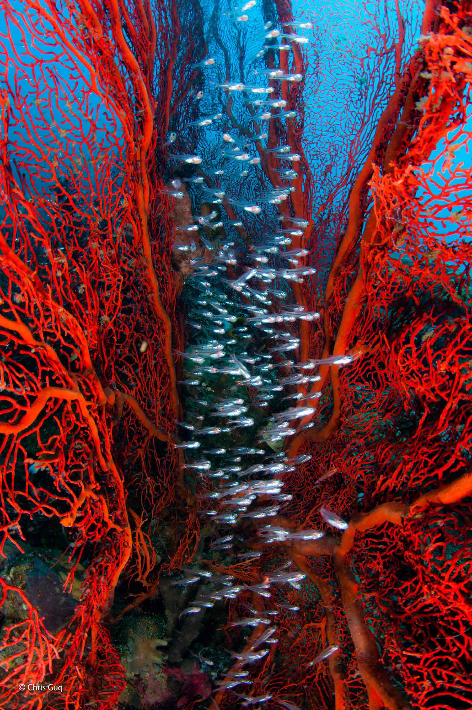
"Silver Streak" by Chris Gug, USA
Nikon D90 + 10-17mm f3.5-4.5 lens at 17mm; 1/50 sec at f14; ISO 100; Aquatica housing; two Ikelite DS-161 strobes.
"Apocolypse" by Francisco Negroni, Chile
Nikon D300 + Sigma 70-200mm f2.8 lens; 1/541 sec at f2.8; ISO 200; tripod; remote control.
"Owlets United" by Sitara Karthikeyan, India
Canon EOS-1D Mark IV + 300mm f2.8 lens + 2x extender; 1/400 sec at f5.6 (-0.7 e/v); ISO 640; Benro tripod + Jobu Design gimbal head.
New York City Apartment by Do Ho Suh
At Bristol Museum and Art Gallery
For my second gallery report I went back to Bristol Museum and Art Gallery to see the exhibition "New York City Apartment" by Do Ho Suh. I had been seeing pictures of this exhibition on social media over the past few weeks and was very keen to see more, so I looked it up online which is what helped me make my choice to go see the exhibition.


The exhibition was held in gallery 5, upon entering the gallery we were greeted by a gallery supervisor, Casey. She was very friendly and helpful, and gave us lots of information on the artist and his work. We were the only people in the gallery for the first 5-10 minutes which gave us an opportunity to have a good look around and take some really great pictures with no people in the background. The room had white walls and was being brightly lit by a window in the ceiling, and also bright lights above. I liked this because this made the brightly coloured artwork stand out and you could see every detail. The piece of art was placed directly in the middle of the room, this was initially very overwhelming because you didn't expect it to be so large. There was a white line going around the art and you could only cross this line when the gallery supervisor told you to. There was a sign in front of the art which had clear instructions on, and there were also 2 posters with information on the artist and on the exhibition as I have shown below with photos.
About The Artist:
Do Ho Suh is a Korean sculptor and installation artist, born 1962 in Seoul, South Korea. His work takes many forms, from painting, drawing and printmaking, to sculpture, installation and video. Suh's art hovers between the minimalist concern with the personal space of the individual, and immersive installation.
"I feel displaced, even in the house I grew up in."
These are large scale photos I took of the art from many different angles, you can see that from some angles the material appears opaque then from other angles it appears transparent. Home from Home is the ghost architecture of a soft corridor and staircase tailored from fabric based on the artist's home in New York. It arrived in Bristol in 2 suitcases and it took a week to be assembled by the museum staff.
I was especially surprised and excited when I saw the tiny details on the art work. It was fascinating to see just how much time, effort and thought went into even the smallest details.
Evaluation:
I was absolutely fascinated with the whole experience of visiting the exhibition. When you first enter the gallery and see the massive piece of art its very overwhelming because of its size and how quiet the room is. The museum supervisor (Casey) definitely made the experience much more pleasant by giving us information leaflets and telling us lots about the art and the artist. I took so many photos on this trip (only one third of the images are on this blog) because I was just so amazed by it. I especially liked that you could walk through it, I think that it's really nice for visitors to see it from a completely different perspective instead of just standing back and seeing it from a boring perspective. Overall I really enjoyed this trip and also enjoyed the assignment, I think I've worked really well with this.
Georgian House Museum
At Bristol Museum and Art Gallery
Introduction
The Georgian House was built between 1788 and 1791 for John Pinney, a West India merchant, and his wife Jane. The architect was William Paty, Bristol's leading architect of the time. At age 22 Pinney had inherited the run-down family sugar plantations on the West-Indian island of Nevis and a house near Crewkerne. On his return to England he settled in Bristol. The house remained in the Pinney family until 1861 when John's youngest son Charles built a much grander house in Clifton. The Georgian House was given to the City of Bristol in 1937 by Canon R.T.Cole and is open to the public as a period-house museum. The house is typical of many built for the merchant classes. It is compact although, since it is built on a steep hill, its true size (there are 6 floors) is not apparent from the front. The rooms are modest in scale with classical detailing on friezes and chimneypieces.
Entering the Museum
We visited the Georgian House on 10th June, and we got there at about 1.30. The photo above shows the outside of the museum, from outside it looks very bland and boring, and quite run down. The image below shows construction next door to the museum, I was very disappointed to see this as it's very unattractive and makes the museum look very messy.
The image below shows a row of Victorian style houses to the right of the museum, I took this photo because I saw an opportunity for a photo with a great composition, and I also find these houses very pretty.
I was very surprised when we actually went into the museum as it was so beautiful on the inside, the outside is definitely misleading. We were the only visitors in the museum the whole time, the only other people there were the museum supervisors and some window cleaners in the drawing room. The majority of the rooms had 2 stands with rope attached, so you couldn't actually walk into the room properly and touch things. Other rooms were closed off by a glass window, so you couldn't walk in at all but could still see everything.
Ground Floor
Study
The study was originally separate from the hall and entered by the door round the corner. Portraits of John Pinney and his second son Azariah hang on the window wall. The room contains the only furniture original to the house. The bureau bookcase c.1740 was brought from another Pinney house and stands in its own niche; the two bookcases were built into the house.
The Breakfast Parlour and Eating Room
The two rear rooms were both dining rooms; this was the Breakfast parlour. The arch originally had doors so the rooms could be used individually or opened out for large gatherings. Food was brought up from the kitchen on a butler's lift which runs through the centre well of the back stairs, and served through the door in the far corner of the breakfast room.
To the right of the fireplace are 2 methods of summoning the servants. In 1790, this would have been by means of the bells which still hang in the basement, here the bell was operated by a brass lever. Above the lever is a 19th century speaking tube; the other end is in the kitchen.
The portraits on the fireplace wall are of Elias and Elizabeth Vanderhorst. Elias was American consul in Bristol from 1792. The large painting between the doors (picture 1) shows the Avon Gorge before the Suspension Bridge was built. The window curtains are of the 'festoon' type which John Pinney ordered for these 2 rooms although they were no longer fashionable. The dining table is set for dessert. On the sideboard is displayed part of John Pinney's chinese porcelain service, painted with his arms. The mahogany urn is fitted for cutlery while the round box between the windows was for cheese.
Basement
This image shows the stairs leading up to the first floor, and right in front of you on the right is the entrance to the basement. I like that in this image I'm stood in quite a dark area, the light coming through the window makes a really interesting composition.
As you walk down the stairs towards the basement there are these bells on the wall, they were rung by John Pinney and his family so the servants would know they were needed and in what room they were needed in. I took a photo of these because I've never seen these in real life before, you always see these in films and in books but seeing them in real life was very surprising and pleasing.
Pantry
In large households, the Pantry was ruled over by the butler, the most senior male servant after the steward. The butler oversaw all the other male indoor servants and was also responsible for the wine cellar, the silver and the candles. The pantry retains the original shelving and cupboards which have been painted to approximate to the cane colour of the 1790's. Above the door is a water tank which must originally have been fed from the rainwater downpipe and which in turn fed the lead-lined sink in the window alcove. The brass taps are Victorian and replace earlier ones.
I particularly didn't like this area of the house as it was quite dark and I felt really uncomfortable standing here, although I did find the pantry very pleasant to see, I liked the crockery and cupboards as they're really pretty to look at.
The Cold Water Plunge Bath
Beyond the stairs is a cold water plunge bath, an unusual feature in a town house. Although I found this room very uncomfortable and quite scary, it was still really interesting to look at and the lighting in the room was great.
The Housekeeper's Room
In a modest town house such as this one, it is probable that the Pinneys would have employed a joint cook/housekeeper. Under her command would have been at least one housemaid, one kitchen maid and possibly a laundry maid. The housekeeper enjoyed a privileged position, she was respected by the family for which she worked. This room was the housekeeper sitting room (from the windows she could see anyone arriving at the front door or the tradesmans entrance).
The window to the left of the fireplace was inserted after the house was built, presumably at some time during the 19th century. The colours for this room were chosen on the basis of paint scrapes. By carefully removing the separate layers of paint from an area of wall, it is possible to establish the various decorative schemes throughout the rooms history.
This room is one of the few that has a window which you can look through, so you can't actually walk around or touch anything. It was difficult to take pictures in this room as the lighting was very poor and we weren't allowed to take flash photos, so I edited these photos to make them brighter and clearer.
The Larder
Food storage in the days before refrigeration could be risky, meat and fish were preserved by various methods. A wide range of fruit and vegetables was available, brought from the countryside around Bristol. A close check was kept on all food, meat was weighed when it was delivered and locked in a meat safe. Cheese too was locked away, and dry ingredients were kept in the housekeepers room. The servants generally ate well and could expect one meat or fish meal a day with bread and cheese at other times; there was also a daily ale allowance. Any leftover food was dispensed by the housekeeper to the poor. The sugar cone in this image was donated by Tate and Lyle and the cheeses were donated by the English Country Cheese Council.
The Kitchen
John Pinney's kitchen staff were luckier than most of their contemporaries; because the house is built on a steep slope, the kitchen is above ground level and enjoys plenty of natural daylight. The table and Windsor chairs are left unpolished so that they could be scrubbed clean. Much of the cooking was done on the open fire; the enclosed range had only recently been invented.
In the 18th century most kitchen utensils were of metal or wood; china was still considered too valuable for such use. The servants ate off pewter plates and the copper and brass pans, bowls and ladles added a touch of colour to the otherwise rather plain surroundings. The pans were cleaned with a mixture of salt, vinegar and silver sand. The door in the left hand corner leads to a small room from which a butlers lift carried food up to the serving hatch into the dining room.
I really liked this room because the lighting was amazing, although the basement was for servants and not considered living standard, I found this room really comfortable and bright. I also like the colour scheme of these images.
The Garden
Little evidence survives for the original layout of the garden which was bounded on the south side by a coach house and stable. The present garden shown above was laid out in March and April 2011. The decorative elements of the design were taken from drawings of a garden in St James's Square, Bristol, dating from around 1806. Although I know the garden isn't the original garden, I found it really peaceful and pleasant to look at. There was a museum supervisor doing some gardening which I found interesting. The only thing I disliked is that you couldn't go into the garden, because I would've really enjoyed this.
The Laundry
Although this room served principally as the Laundry, the fire is fitted with a spit mechanism so that the room could be used as a second kitchen. The Laundry is the only room in the house with a direct water supply. Originally the house relied on rain water which was fed down from the roof to the tank in the sub-basement and was pumped up as required.
In the centre of the room stands a box mangle for pressing linen. Washing was usually done weekly and according to a strict routine as with all household activities. The dirty linen was collected on Saturday and put to soak ready to be washed on Monday. Soap was made at home from waste fat from the kitchen or bought oil and 'lye', a liquid obtained by pouring water over wood ash. On Friday the linen was folded, sorted and put away and the Laundry cleaned out ready for the next weeks wash.
I particularly liked this room because there was no barrier or glass window, you could go in and walk around to look at every detail close up.
First Floor
Library
This room was originally a bedroom but is now displayed as a library, housing an amazing double secretaire bookcase c.1800 and a collectors cabinet of c.1745 richly ornamented with brass and gilt-bronze and fitted with more than 50 drawers.
This was one of my two favourite rooms in the house, I was absolutely fascinated by the beautiful furniture in this room, especially the globes and the collectors cabinet. I also really liked the colour scheme to this room, it had a really elegant and classy feel to it.
Small Drawing Room
This room was also originally a bedroom but is now a small drawing room. It houses a square piano made in London in 1783 and over the fireplace, a "painting" made from coloured feathers.
Although I found this room quite plain, I still really liked the colour scheme and the cosy feel to it.
Large Drawing Room
This is the main drawing room, decorated in the original 1790s colour scheme and with furniture arranged around the walls in typical Georgian formal style.
I found this room really beautiful and particularly liked the lighting and the colour scheme, unfortunately we weren't allowed in because the floor was unsafe. Although there was a window cleaner in the room which I found rather amusing.
Second Floor
Main Bedroom
The second floor originally contained five rooms, there is little information about the rooms but they are likely to have been bed and dressing rooms. This is the largest room on this floor and, with its position at the back of the house and its entrance lobby, must have been the principal bedroom. The bed dating from c.1785 is hung with a cotton dimity copied from an 18th century sample. A bed "furniture" comprised 4 or 6 curtains, a headcloth, the tester (canopy), outer and inner valances to conceal the iron curtain rod, and "bases" or lower valances, to conceal the bed frame. The candlewick bed cover commemorates the marriage of Thomas and Mary Hitchen in 1856.
This is my second favourite room in the house. I absolutely loved the bed and the cradle in this room, and I also particularly liked the wallpaper. The room had a really happy and "family" feel to it which I liked.
The image above shows the view that John Pinney would've had from the main bedroom window. In front of the Cathedral is a tree covered College Green and in the distance you can see the masts of ships in the harbour. I took the picture below to show the view from the same window today, you can still see the top of the cathedral, but the view isn't as beautiful as the one John Pinney would've had, as it's obstructed by 20th and 21st century buildings.
John Pinney and The Slave Trade

John Pinney (1740-1818) was a merchant who owned multiple sugar and slave plantations on the Island of Nevis in the Caribbean. At the age of 22, Pinney received land from his cousin in south east England. Two years later he maintained plantations on Nevis. Although the family came to own many plantations on Nevis and other islands, John Pinney's main plantation was Mountravers on Nevis where he had the grandest house on the island. When he discovered that many of the slaves he had inherited were too old or weak to work, he sold some of them their freedom. The list of 66 slaves bought by John Pinney between 1765 and 1769 tells us a good deal about the process of buying slaves. Most of them were children, and probably brought straight from Africa. Later he had between 170 and 210 slaves in his 394 acres large plantation. His son Charles continued his father's heritage, although he did not own slaves because of abolition of slavery in the United Kingdom. It is estimated that John's fortune at his death in 1818 amounted to £340,000 (about £17 million today).
Evaluation:
I was absolutely fascinated with the whole experience of visiting the exhibition. When you first enter the gallery and see the massive piece of art its very overwhelming because of its size and how quiet the room is. The museum supervisor (Casey) definitely made the experience much more pleasant by giving us information leaflets and telling us lots about the art and the artist. I took so many photos on this trip (only one third of the images are on this blog) because I was just so amazed by it. I especially liked that you could walk through it, I think that it's really nice for visitors to see it from a completely different perspective instead of just standing back and seeing it from a boring perspective. Overall I really enjoyed this trip and also enjoyed the assignment, I think I've worked really well with this.


 within the
  icon on the desktop.


.jpg)


_09633u.jpg)