Creative Architecture
"Creative architecture:
A firm of architects, specializing design is in the
process of refurbishing its office space. As part
of the décor the firm wants to display in its
conference area a series of black and white or
colour photographs. The images are to show
details of buildings/constructions and their related
urban environment, which could include both
indoor and outdoor settings. These images could
be abstract close ups or ‘The Built Environment”,
buildings (or a part of) in their environment, a
series of architectural nuances repeated."
For this task we were asked to visit three different styled buildings and photograph the things/details that characterize the building. We could choose buildings that mean something to us, or just choose buildings that we enjoy. We also had to take photos of the interior of the building (if possible).
Nicholas Goodden:

Nicholas "Nico" Goodden is the founder of the Street Photography London collective, and is an award winning London based urban photographer. He has a passion for capturing London's urban landscape, streets, people and architecture through still photography, cinemagraphs and timelapse photography.


I'm very fond of Gooddens work and I'd love to interpret his style into my own work. I especially like his minimal urban photography and his urban landscape images. I think his time-lapse photography and cinemagraphs are really effective and I'd definitely like to try those styles in my own work. His style is very fresh and unique and I've been very inspired by his work, it's a pleasure to explore his images.
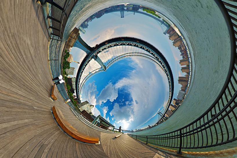
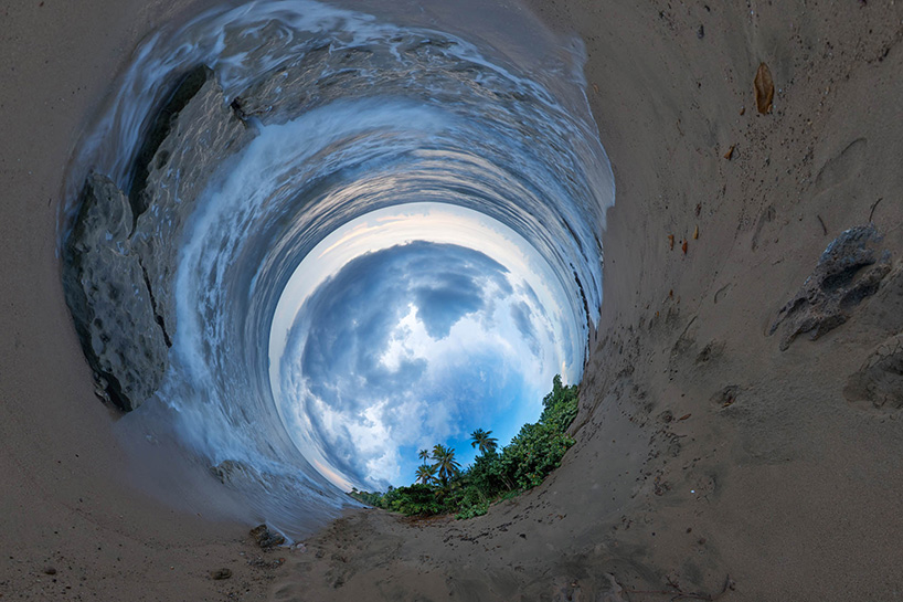
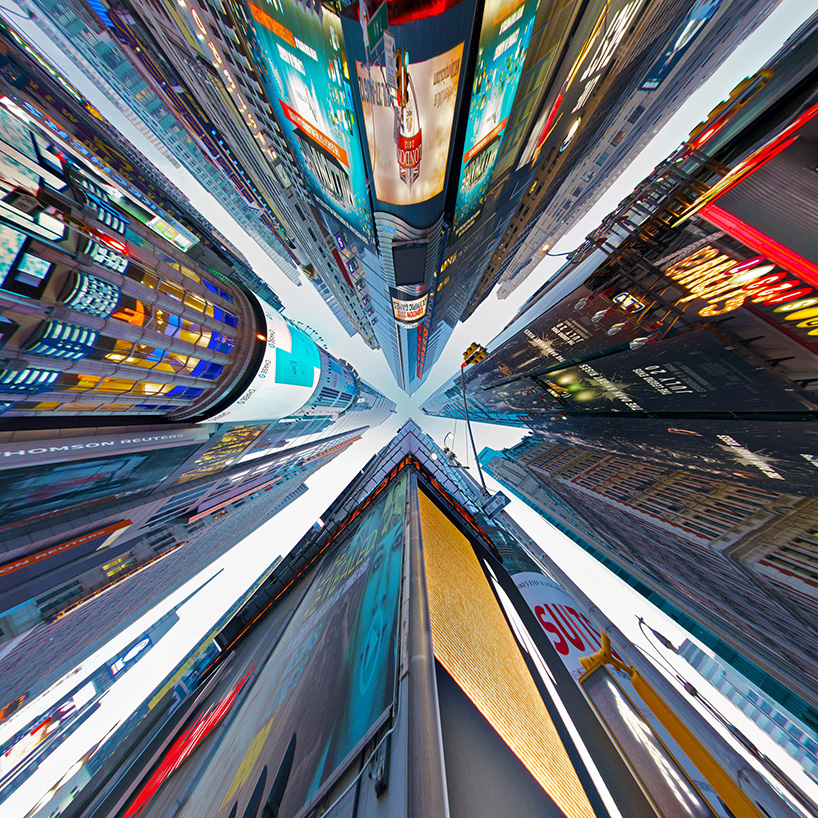
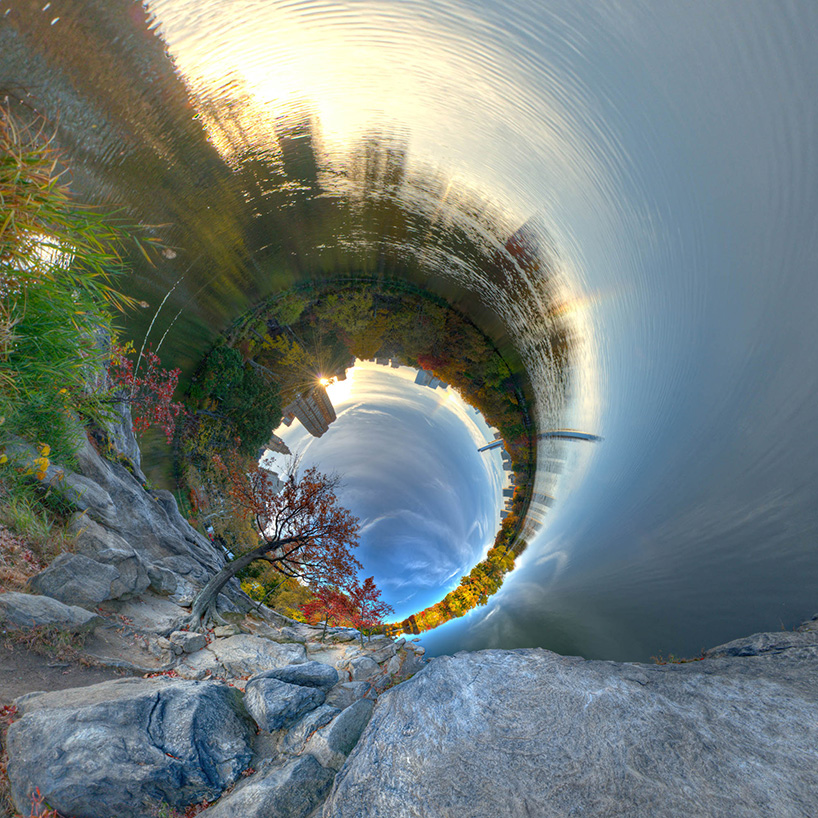
Randy Scott Slavin:

Randy Scott Slavin is an award winning director and surrealist photographer based in New York City. He is widely known for his powerful music videos and branded productions that mash up clever concepts with bold imagery, and channel the energy of pop culture.
Alternative Perspectives
Named Alternative Perspectives, these images present a series of panoramic views that curve around to form impossible circles. Slavin shoots with a Nikon D800. These images particularly caught my eye because we created images very similar to these last year, I really enjoyed this so I'd like to interpret this style into my own work once again. I love the vibrant colours in all of these images and find it amazing how much time and effort Slavin puts into this project.

Ideas/Planning:

This is my overall mind map for creative architecture. I added a 'location' list; a list of possible locations for my 3 shoots, and also type of shots, style, camera settings, equipment and health and safety to plan my shoots appropriately. I added 2 architecture artists to my mind map too, to remind me to research them later on. I decided to go with Blaise Castle House Museum for my first shoot, Bristol Cathedral for my first shoot and Cabot Circus for my third shoot.
Shoot 1, Blaise Castle House Museum:
Research:

Blaise Castle is an 18th century mansion house and estate near Henbury, where I live. The house was built by John Harford, a wealthy Bristol merchant in 1796-1798. It was designed by William Paty, and John Nash added a conservatory c. 1805-1806. Harford also had Blaise Hamlet built to house his servants and tenants. A branch of the Bristol Museum and Art Gallery since 1949, Blaise Castle House now displays vintage toys, costumes and other Victorian everyday objects.
I chose to use Blaise Castle House Museum for my first shoot because I've found the building fascinating ever since I was a small child, I've always lived close to Blaise Castle Estate and I spent a lot of my childhood playing in the grounds and exploring the house museum and other monuments. I chose to only photograph the outside of the house, although I do really enjoy the museum I think photographing the inside would ruin the authentic feel of the shoot, and wouldn't let you really appreciate how beautiful the building is.
Blaise Castle House c. 1940
I chose to use Blaise Castle House Museum for my first shoot because I've found the building fascinating ever since I was a small child, I've always lived close to Blaise Castle Estate and I spent a lot of my childhood playing in the grounds and exploring the house museum and other monuments. I chose to only photograph the outside of the house, although I do really enjoy the museum I think photographing the inside would ruin the authentic feel of the shoot, and wouldn't let you really appreciate how beautiful the building is.
Contact Sheet:


The photoshoot was taken around 7.30pm, just before sunset. I chose this time because I didn't want any members of the public to be walking around as I was doing my shoot, because I felt that having people in the shots would ruin them. I put my camera (Canon 1100D) in aperture priority and used an f stop of f.8/f.9. I photographed the outside of the building from every angle possible to ensure I had a wide selection of images, and I also photographed some closer details of the building, such as the goblets with intricate designs.
Best Images:


Aperture-F/9.0 Shutter Speed-1/40 ISO-800
This view is from the back of the house, I really like the angle and lighting of this image and I think the contrast between the grass and the sky is really effective. This image has a really vintage feel to it.

Aperture-F/8.0 Shutter Speed-1/40 ISO-2000
This image is my favourite from the shoot, I think it has a really effective composition. The goblet on the right of the image and the trees at the top stop the image from being too bland.

Aperture-F/8.0 Shutter Speed-1/60 ISO-3200
This is a close up of one of the large goblets outside the house, I like the lighting and shadows in this image and how well you can see the details.

Aperture-F/8.0 Shutter Speed-1/30 ISO-2000
This is my second favourite image from the shoot, I love the composition and detail in this photo. This image shows an effective double vanishing point.
Failed Images:

Aperture-F/9.0 Shutter Speed-1/15 ISO-3200
This image is slightly too blurry and the white balance is ineffective, you can also see some construction fencing in the middle of the photo which I think ruins the composition.

Aperture-F/8.0 Shutter Speed-1/40 ISO-3200
The composition and angle of this image isn't effective enough.
Edits:


I added shadows, highlights and a vignette border to this image, I also increased the contrast and I think this is really effective.

I first converted this image into black and white, then lowered the brightness and increased the contrast. I also added more shadows to give this image a really mysterious but effective feel.

I increased the brightness and contrast of this image, and then added shadows, highlights and a pink tone to make the image look really vintage.

I converted this image into black and white, then increased the brightness and added highlights. I also added a grainy effect to the image to make it look older and gloomier.
Development Through Photoshop:


For this edit I first unlocked the layer by double clicking the padlock icon in the layers bar, then when "new layer" popped up I clicked okay, this is so I can transform the image. I slightly rotated the image then used the crop tool to crop the image slightly smaller.

Next, I went to image > adjustments > colour balance then +1- on red, to give the image a slight red tint.

To make the image bolder, I went to image > adjustments > brightness/contrast then contrast +10 to make the image bolder.

Next, I went to image > adjustments > levels... then adjusted the levels until I was happy with the image.

Final Image
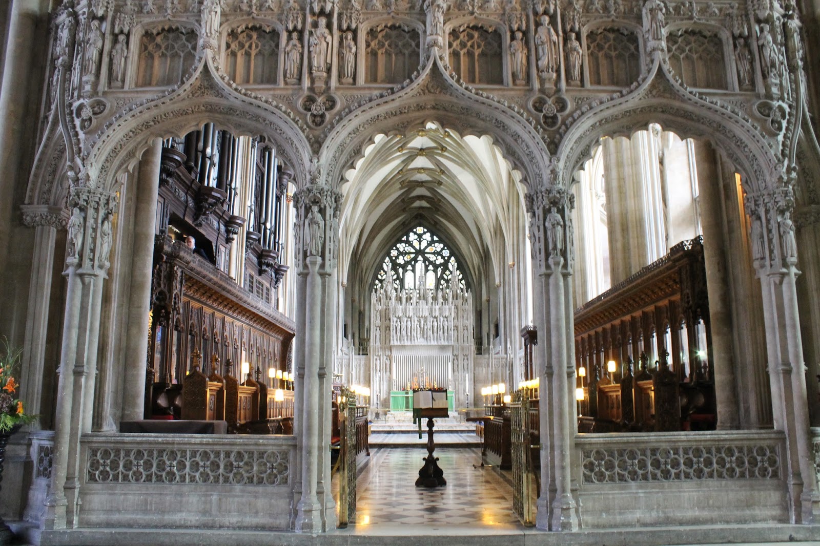
Shoot 2, Bristol Cathedral:
Research:


The West Front of the Cathedral, 2014.
Bristol Cathedral, formally the Cathedral Church of the Holy and Undivided Trinity, is the Church of England cathedral in Bristol. Founded in 1140 and consecrated in 1148, it was originally St Augustine's Abbey. The eastern end of the church includes fabric from the 12th century, with the Elder Lady Chapel which was added in the early 13th century. Much of the church was rebuilt in the English Decorated Gothic style during the 14th century despite financial problems within the abbey. The western twin towers, designed by John Loughborough Pearson were completed in 1888. In addition to the cathedral's architectural features, it contains several memorials and an historic organ. Little of the original stained glass remains with some being replaced in the Victorian era and further losses during the Bristol Blitz.
Bristol Cathedral in an 1873 engraving, still incomplete.
Contact Sheet:


I chose Bristol Cathedral as my second building because it's one of my favourite architectural buildings in Bristol. I first visited this Cathedral when I first started college, because I walked past it every single day on my way to college and was intrigued to see it from the inside. I remember being so surprised at how beautiful the interior was, and felt that it would produce some really powerful images. I chose to do this shoot at around 2.45-3.30pm, because it was daylight which would be effective for the photos of the outside of the building. For the indoor photos I used an average aperture of f.6 - f.9, and a shutter speed of 1/25. For the outdoor photos I used an aperture of f.8 and a shutter speed of 1/100-1/250.
Best Images:


Aperture-F/9.0 Shutter Speed-1/50 ISO-160
This image shows a statue in Bristol Cathedral, I really like how this image consists of the same colour but lots of different shades and tones. I also like the contrast of this image and the lighting.


Aperture-F/9.0 Shutter Speed-1/20 ISO-3200
This image shows an ornate screen in front of the choir in the cathedral, I really love the intricate details of this image and the different colours within the image. I also like how you can see the lights in the choir glowing.


Aperture-F/8.0 Shutter Speed-1/40 ISO-2500
This image shows the ceiling of the Elder Lady Chapel in Bristol Cathedral. I really like how abstract and interesting this image is, and I also really like the white/gold contrasting colour scheme. This is definitely one of my most effective images.

Aperture-F/9.0 Shutter Speed-1/50 ISO-160
This image shows a statue in Bristol Cathedral, I really like how this image consists of the same colour but lots of different shades and tones. I also like the contrast of this image and the lighting.

Aperture-F/9.0 Shutter Speed-1/30 ISO-200
This image shows a row of stain-glassed windows in the cathedral, I love how the different colours in the glass contrast with the dull dark walls and floor in this image. I also really like how the beams of light coming through the glass look like rays of sunshine.
Aperture-F/9.0 Shutter Speed-1/20 ISO-3200
This image shows an ornate screen in front of the choir in the cathedral, I really love the intricate details of this image and the different colours within the image. I also like how you can see the lights in the choir glowing.

Aperture-F/8.0 Shutter Speed-1/250 ISO-100
This image shows the roof of the cathedral photographed from the outside. I really like the effect of the sun shining through the middle of the cathedrals points. I also like the contrast between the bright sky and the dark cathedral.
Failed Images:

Aperture-F/8.0 Shutter Speed-1/15 ISO-3200
This image failed because it hasn't got an interesting composition and the image also has really bad camera shake.

Aperture-F/8.0 Shutter Speed-1/40 ISO-160
This image failed because it's underexposed in some parts and overexposed in others.


Aperture-F/9.0 Shutter Speed-1/20 ISO-3200
This image failed because the composition is really boring.

Aperture-F/8.0 Shutter Speed-1/15 ISO-3200
This image failed because it hasn't got an interesting composition and the image also has really bad camera shake.

Aperture-F/8.0 Shutter Speed-1/40 ISO-160
This image failed because it's underexposed in some parts and overexposed in others.

Aperture-F/9.0 Shutter Speed-1/30 ISO-3200
This image failed because the angle is on a slant when it should've been a straight portrait angle, and it also has bad camera shake.

Aperture-F/9.0 Shutter Speed-1/20 ISO-3200
This image failed because the composition is really boring.
Edits:


For this image I lowered the brightness and also sharpened the image, to make it feel more mysterious but bring out the details. I also added shadows and highlights to make the dark and light areas really pop out, and lastly added a blue tint because I think it looks much better.

In this image I first converted it to black and white, so every change I made after that would be a lot stronger. I then decreased the brightness and increased the contrast to make the image dark and to give it a mysterious feel. I lastly added shadows and highlights to make the dark and light areas really pop out.

For this image I first decreased the brightness and increased the contrast, so it would be dark but really colourful. I also added both shadows and highlights to make the dark areas really dark and to make the glass windows really stand out. Lastly I gave the image a colour boost to make the stained glass windows really colourful.

For this image I first decreased the brightness and increased the contrast to make the details stand out much more, I then added shadows and highlights to make both the light and dark areas really pop out. Lastly I added a slight green tint to the image because I think this gives the image a slight vintage feel.

For this image I first converted it into black and white, so the changes I added after that would really stand out. I then decreased the brightness and increased the contrast to make the image darker but also much bolder. Lastly I added shadows and highlights to make the details stand out even more, this is my favourite edit out of all the edited images I did. I think the black and white with the high contrast makes it look like an old fashioned processed image.

For this image I increased both the saturation and the contrast, to give it more of an orange tint than blue, and also increased the highlights to make the details stand out more.

For this image I first decreased the brightness and increased the contrast to make the image slightly darker but bolder. I also added both shadows and highlights to make the dark and light areas stand out.
Development Through Photoshop:


I wanted to straighten this image and bring out the colours more. I first double clicked the padlock icon in the layers bar, then when the new layer box popped up I clicked ok. This allows me to transform the layer. I made sure the show transform tools box was ticked, then rotated the image slightly to make it straight.

I then used the rectangular marquee tool to select the edges I didn't want, clicked the move tool then pressed the backspace key on the keyboard to delete the selection.


I went to image > trim, made sure transparent pixels was selected then pressed ok. This trimmed the transparent border from the image.

I then went to image > adjustments > brightness/contrast and increased both to +20. This was to make the coloured windows more bright and colourful.

This was the final outcome.
Shoot 3, Cabot Circus:
Research:

Cabot Circus is a shopping centre in Bristol, where we live. It is adjacent to Broadmead, a very well known shopping area in Bristol city centre. The Cabot Circus development area contains shops, offices, a cinema, hotel and 250 apartments. It covers a total of 1,500,000 sq ft floor space, of which 1,000,000 sq ft is retail outlets and leisure facilities. It opened in September 2008, after a ten-year planning and building project costing £500 million. Before the building of Cabot Circus the site contained post war shopping units and part of the A4044 Bristol inner ring road. Work began on the site in September 2005, following planning approval in December 2003. Cabot Circus comprises three multi-level pedestrianised streets, with apartment block areas. Its focal point, The Circus, has a large glass-panelled roof. The complex was opened to shoppers on 25 September 2008.
Cabot Circus has over 120 shops, two department stores, several restaurants, a thirteen-screen Showcase Cinema de Lux, an Adventure Golf centre and is split into two areas, the circus itself and Quakers Friars. The circus is divided into three streets and multiple levels. Outlets include New Look, Urban Outfitters, Zara, The Body Shop and House of Fraser. Above at the highest level are eateries and the cinema. Other outlets in the area include French Connection, Hugo Boss, Thomas Pink, Lacoste and an Apple Store.
Research:
Cabot Circus 2011
Cabot Circus is a shopping centre in Bristol, where we live. It is adjacent to Broadmead, a very well known shopping area in Bristol city centre. The Cabot Circus development area contains shops, offices, a cinema, hotel and 250 apartments. It covers a total of 1,500,000 sq ft floor space, of which 1,000,000 sq ft is retail outlets and leisure facilities. It opened in September 2008, after a ten-year planning and building project costing £500 million. Before the building of Cabot Circus the site contained post war shopping units and part of the A4044 Bristol inner ring road. Work began on the site in September 2005, following planning approval in December 2003. Cabot Circus comprises three multi-level pedestrianised streets, with apartment block areas. Its focal point, The Circus, has a large glass-panelled roof. The complex was opened to shoppers on 25 September 2008.
Cabot Circus has over 120 shops, two department stores, several restaurants, a thirteen-screen Showcase Cinema de Lux, an Adventure Golf centre and is split into two areas, the circus itself and Quakers Friars. The circus is divided into three streets and multiple levels. Outlets include New Look, Urban Outfitters, Zara, The Body Shop and House of Fraser. Above at the highest level are eateries and the cinema. Other outlets in the area include French Connection, Hugo Boss, Thomas Pink, Lacoste and an Apple Store.
Contact Sheet:


I decided to photograph cabot circus as my third building because it's a modern building, and as my previous two buildings were very old I wanted to balance the task out. I also find cabot circus very interesting and knew I could take some really creative photos. I took these photos from around 12.30pm-1.20pm, I put my camera (Canon 1100D) in manual settings and used a shutter speed of 1/20, aperture of f.22 and ISO 100.
Best Images:


Aperture-F/22 Shutter Speed-1/15 ISO-100
This is my favourite image from this shoot. I really like the boldness and details, and also how the colours of the building contrasts with the sky. 
Aperture-F/22 Shutter Speed-1/20 ISO-320
I really like the composition of this image and all the reflections within the frame. I also like how the red colours of the chairs and the signs contrasts with the dull colours of the architecture.

Aperture-F/22 Shutter Speed-1/20 ISO-125
This is also one of my favourite images from the shoot, I really like the different patterns within the architecture and the different colours in the frame.
Failed Images:


Aperture-F/22 Shutter Speed-1/20 ISO-640

Aperture-F/22 Shutter Speed-1/15 ISO-100
This image failed because the composition isn't interesting enough, and I didn't mean to capture the left building in the image. However, I do like the reflections in this image.

Aperture-F/22 Shutter Speed-1/15 ISO-100
This image failed because the people in the frame ruin the composition, and it's underexposed. To avoid this in future shoots, I would take a tripod with me and use a long shutter speed to cut all people out of the frame.

Aperture-F/22 Shutter Speed-1/20 ISO-640
This image has an interesting composition and lighting but yet again the people in the frame ruin the image.
Edits:


Edits:

For this edit I decreased the brightness and increased the contrast, to make the image slightly darker but a lot bolder. I also added shadows to make the dark areas really stand out. I think this makes the image look much more effective.

For this edit I gave the image a red tint, because the image had too much of a blue tint and it was very dull. I also increased the brightness and the contrast to make the image brighter and bolder, and increased both the highlights and shadows to give a sparkle/reflection effect.

For this edit I decreased the brightness a lot, because you could see people sat in the restaurant and I think this ruined the composition. I then added shadows and highlights to make the dark areas really dark and make the light areas (the fish) really bright. Lastly I significantly increased the contrast to make the fish stand out.

For this edit I slightly decreased the brightness because the image was overexposed, and increased the contrast to make the colours really pop. I lastly added shadows and highlights because this makes the image really bold.

For this edit I converted the original colour image into black and white, then decreased the brightness and increased the contrast. I went into levels and adjusted the levels until I was happy with the image. Lastly I added shadows to bring out the details more.
Development Through Photoshop:


First I double clicked the padlock icon, then clicked "OK" to create a new layer. This is so I can transform the layer.

I then hovered the cursor over the corner of the image until a rounded arrow appeared, which means I can rotate the image. I then rotated the image slightly until it was straight.

I used rectangular marquee tool to select the spaces that I don't want, then pressed the backspace key on the keyboard to delete them. This is to make the image proportional.


I went to image > trim, made sure transparent pixels was selected then pressed ok. This gets rid of the transparent border.

Next, I went to image > adjustments > levels then adjusted the levels until I was happy with the image, I wanted to make my image really bold and contrasted, to make it look abstract.

I then went to image > adjustments > brightness and contrast then increased both to +5, to make the image even more so contrasted and bright.

This is the final outcome.
18/09/15 Bristol Architecture
There was no research or planning necessary for this shoot as we were sent out to take these photos. Our task was to take pictures of modern buildings, especially focusing on lines and sky. I set my camera to manual, used an aperture of f/22, a shutter speed of 1/15 and an ISO of 100, to ensure everything in the frame would be in focus. I started taking these photos at around 11.30am and finished at around 12.30pm, it was a very bright sunny day so some images were very overexposed.
Contact Sheet:


Best Images:

Aperture-F/22 Shutter Speed-1/15 ISO-100
I really like this image because it has an interesting composition and lots of different colours. I also like the different reflections you can see in the frame.

Aperture-F/22 Shutter Speed-1/15 ISO-100
This is my favourite image from this shoot, I really like the composition of this image as it looks like a skyline even though it's only a couple of buildings.
Aperture-F/22 Shutter Speed-1/15 ISO-100
I really like this abstract image and the contrast between the building and the sky.

Aperture-F/22 Shutter Speed-1/15 ISO-100
I like the contrast between the building and the sky in this image but I think it could have a more interesting composition.

Aperture-F/22 Shutter Speed-1/15 ISO-100
I really like the symmetry of this image and the interesting composition, the contrast between the blue sky and the sandy-brown building is effective, and the windows on the building add interest to the image.
Failed Images:


Aperture-F/22 Shutter Speed-1/15 ISO-100
This image has an interesting composition but it's slightly overexposed and has camera shake.

Aperture-F/22 Shutter Speed-1/15 ISO-100
The contrast between the red building and the blue sky in this image is interesting but the composition isn't effective and the image has slight camera shake.

Aperture-F/22 Shutter Speed-1/15 ISO-100
The composition of this image isn't effective and it's very overexposed.
Edits:


For this edit I decreased the brightness slightly and increased the contrast to make the image bolder, I also added a yellow tone to the image which I think makes it more effective.

For this edit I decreased the brightness so you can see the details more clearly, and increased the contrast. I also added a yellow tone.

For this edit I increased the contrast significantly, I think this gives the image a pop art feel and is very effective.

For this edit I converted the image into black and white, then decreased the brightness and increased the contrast. This makes the image really bold and is even more-so effective in black and white because you can see the details really clearly.

For this edit I converted the image into black and white, then increased the contrast to make it bold.
Development Through Photoshop:

First I double clicked the padlock icon, then clicked "OK" to create a new layer. This is so I can transform the layer.

I then hovered the cursor over the corner of the image until a rounded arrow appeared, which means I can rotate the image. I then rotated the image slightly until it was straight.


I went to image > trim, made sure transparent pixels was selected then pressed ok. This gets rid of the transparent border.


I then hovered the cursor over the corner of the image until a rounded arrow appeared, which means I can rotate the image. I then rotated the image slightly until it was straight.

I used rectangular marquee tool to select the spaces that I don't want, then pressed the backspace key on the keyboard to delete them. This is to make the image proportional.


I went to image > trim, made sure transparent pixels was selected then pressed ok. This gets rid of the transparent border.

Next I went to image > mode > grayscale to make the image black and white, this makes the details and shadows in the image stand out more.


I went to image > adjustments > levels then adjusted the levels until I was happy with the outcome.

This is the final outcome.
The only thing I'm unhappy with is the dust marks on some of my images, although it's easy to edit these out of the picture it's a shame they've ruined some of the compositions. I've since cleaned my camera lens mirror to prevent this in the future.
Animals
Research:
David Lloyd:

Born: New Zealand
David Lloyd is a wildlife photographer living in London, although he is originally from New Zealand. He arrived in London in 1989 for a six month journey and ended up staying. Some of his favourite places are Kenya, Rwanda, Uganda, Botswana and Richmond park, which is just a few miles from his home in London.
He enjoys working in both black and white and colour, and uses 3 Nikon D800E's. He also has a Nikon F3/T with a motordrive and 50mm f/1.2 lens, all in pristine condition. He processes everything in Adobe Lightroom and rarely uses Photoshop as he prefers to keep away from cloning and retouching, to keep things as natural as possible. David Lloyd hosts photographic safaris in the Maasai Mara several times a year.
"Possibly the best tip I can suggest is to stay with your subject for as long as possible."
I'm very fond of David Lloyd's work and I like that he doesn't work in Photoshop to keep everything as natural as possible. His work is so bold and holds so much emotion but is so natural at the same time. Although I wouldn't photograph wild animals/safaris like Lloyd, I'd like to use similar compositions and photographic techniques to his in my animal work, to create dynamic and bold images.


Planning:

Contact Sheet:

Images:


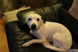
Although the composition of this photo isn't great and some areas are blurred, it has a great focus on the dog's eyes. It makes her eyes stand out and look really bold.


David Lloyd:
Born: New Zealand
David Lloyd is a wildlife photographer living in London, although he is originally from New Zealand. He arrived in London in 1989 for a six month journey and ended up staying. Some of his favourite places are Kenya, Rwanda, Uganda, Botswana and Richmond park, which is just a few miles from his home in London.
He enjoys working in both black and white and colour, and uses 3 Nikon D800E's. He also has a Nikon F3/T with a motordrive and 50mm f/1.2 lens, all in pristine condition. He processes everything in Adobe Lightroom and rarely uses Photoshop as he prefers to keep away from cloning and retouching, to keep things as natural as possible. David Lloyd hosts photographic safaris in the Maasai Mara several times a year.
"Possibly the best tip I can suggest is to stay with your subject for as long as possible."
I'm very fond of David Lloyd's work and I like that he doesn't work in Photoshop to keep everything as natural as possible. His work is so bold and holds so much emotion but is so natural at the same time. Although I wouldn't photograph wild animals/safaris like Lloyd, I'd like to use similar compositions and photographic techniques to his in my animal work, to create dynamic and bold images.

"Bond of Brothers", Serengeti, Tanzania, March 2015

"Leopard (Saba)", Maasai Mara, Kenya, March 2015

"Little Red Dot", Maasai Mara, Kenya, February 2015

"Wildebeest", Maasai Mara, Kenya, March 2015

This is my mind map of ideas for an animal themed shoot. I had many different ideas but decided I'd just take pictures of dogs, as it's a simple idea but I can create some really interesting images. I took these photos over the course of a few days, some images are of dogs I have seen in public, and I just took out my camera and photographed them as a spur of the moment image, and some images are of dogs that belong to family/friends. Most of the images I shot at eye level, as I think this looks really effective and personal between myself and the dog.
Contact Sheet:

Images:

I took this photo just outside of St Nicholas Market, as I was walking past the dog really caught my eye with his cuteness, and I also noticed the great composition surrounding the dog.

This photo was taken outside of Sainsburys in Broadmead. I thought that getting down to the dogs eye-level would create a more interesting composition.

Although the composition of this photo isn't great and some areas are blurred, it has a great focus on the dog's eyes. It makes her eyes stand out and look really bold.

This is probably my favourite photo from the shoot of dogs. Even though the image is slightly overexposed the composition and focus are great, and the details of the dog are bold and striking.

Although this image hasn't got a very effective composition and focus, the contrast between the red sofa, the dogs black/ white fur and her brown eyes and collar are interesting.
Edits:


This is a very subtle edit. I just decreased the brightness slightly and increased the contrast to make the image bolder. I also sharpened the image.

I made this image black and white because I think it gives it more emotion, I also increased the brightness and contrast.

I decreased the brightness in this image and increased the contrast, I also added a red tint to the whole image and sharpened it.

I increased the contrast and brightness of this image and gave it a really slight green tint.
Development Through Photoshop:


Firstly I sharpened the image, I did this by going to filter > sharpen > unsharp mask, then changed the amount to 80% and the radius to 4.8 pixels. Usually I would use an amount of 70% and a radius of 3-4 pixels, but I wanted this image really sharp.

Next, I went to image > mode > grayscale, to make the image black and white. I wanted this image black and white because I personally think that images look much more effective in black and white, and I think this look gives the image more emotion, definition and detail.


To make the image brighter and bolder, I went to image > adjustments > brightness/contrast then changed both the brightness and contrast to +10. As you can see, this makes the image much brighter and less dull.


I then went to image > adjustments > levels.. then adjusted the levels of the image until I was happy with the outcome.


Last of all I went to image > adjustments > Shadow/Highlight.. then adjusted the highlights and shadows as shown in the above picture. This made the image even more bold, I really like the effect this gave to the image.

This is the final outcome, and I'm extremely happy with this edit as I experimented with new techniques in Photoshop instead of just using my usual techniques.
Environmental Portraiture
Research:
Eric Kim

"I put my heart and soul into my street photography blog, and I hope you share the same passion that I do."


The images above are a selection of Eric Kim's coloured work. I chose Eric as my artist to research for this selection of this unit as street photography is one of my favourite types of photography, and I really love his work. I really like how real his images are, they're not set up, they're photos of real people being as natural as possible. As much as I enjoy his coloured work, I decided that I preferred his black and white work (shown below), and I'd use his black and white work as inspiration for my own portraits.


Planning:


The first mind map above is a general mind map for environmental portraiture, it includes all of my ideas for the shoot and all the technical specifications too. The second mind map is my developed idea for environmental portraiture, my idea was to photograph people that work on market stalls in St Nicholas market and also in small local businesses around Bristol city centre. Although I chose not to go forward with this idea for my final option, I still decided to take a few photos (shown below) involving these ideas to give an idea of what this idea could've turned out like. As well as taking photos of market stall workers, there are also random photos of people shown that I've taken whilst out in public, as I always have my camera on me. The coloured images are the original versions and the black and white images are the edited versions, I always knew I wanted these images to be in black and white with a high contrast because this makes them look really classy and dynamic, and also in the style Eric Kim's black and white work.
Eric Kim doesn't ask to take people's photos, he just goes up and shoots away with his camera. As easy as this sounds, I really didn't want to be rude to people with this shoot (as well as not wanting to get arrested or punched in the face!), so I asked each person if I could take their photograph. I did this by approaching them with a smile, then started with "Hi, I'm a photography student from City of Bristol College photographing people from Bristol for a city life unit, I was wondering if I could please take your photograph?". I had a few rejections from people, but also had lots of friendly people who were more than happy to pose for a photo. I worded the question that way as I wanted to be as polite as possible and didn't want to be too pushy. After I took the photograph I said "Thankyou very much, I really appreciate it" and went on my way.


Eric Kim

Eric Kim is a street photographer currently based in Berkeley, California. As an undergraduate at UCLA, he studied Sociology and combined it with his passion for photography to make statements about society through street photography. When he started street photography, he had a difficult time approaching street photography. He was unsure of how to take a photo of a stranger without their permission and not get people angry, unsure of what to look out for when shooting on the streets, and unsure of what made a great street photograph.
In 2011 he got laid off of his former job, which gave him the opportunity to travel the world and teach street photography workshops full time to those wanting to conquer their fear of shooting in the streets breaking out of their comfort zone. He has taught all around the globe, including cities such as London, Paris, Zurich, Amsterdam, Prague, Venice, Dubai, Mumbai, Tokyo, Kuala Lumpur, San Francisco, New York and Chicago. He's also collaborated with brands such as Leica, Fujifilm, Olympus, Ricoh, Samsung and Ford.
"I put my heart and soul into my street photography blog, and I hope you share the same passion that I do."


The images above are a selection of Eric Kim's coloured work. I chose Eric as my artist to research for this selection of this unit as street photography is one of my favourite types of photography, and I really love his work. I really like how real his images are, they're not set up, they're photos of real people being as natural as possible. As much as I enjoy his coloured work, I decided that I preferred his black and white work (shown below), and I'd use his black and white work as inspiration for my own portraits.


Planning:


Eric Kim doesn't ask to take people's photos, he just goes up and shoots away with his camera. As easy as this sounds, I really didn't want to be rude to people with this shoot (as well as not wanting to get arrested or punched in the face!), so I asked each person if I could take their photograph. I did this by approaching them with a smile, then started with "Hi, I'm a photography student from City of Bristol College photographing people from Bristol for a city life unit, I was wondering if I could please take your photograph?". I had a few rejections from people, but also had lots of friendly people who were more than happy to pose for a photo. I worded the question that way as I wanted to be as polite as possible and didn't want to be too pushy. After I took the photograph I said "Thankyou very much, I really appreciate it" and went on my way.


I really like the composition of this image and I also like how the subject isn't smiling or posing, he looks completely natural which is really effective in environmental portraiture.


This image is interesting because there's 2 subjects instead of 1, it's not as natural because they're smiling/posing but it's still a good image which an effective composition and happy feel.


I love the effective composition of this image but it would've looked better/much more natural if the subject wasn't posing. The colours in the image also work really well together.
Documentary Option
Research:
Ronya Galka

Born: Germany
Ronya Galka is a German urban and street photographer living in London since 1990. She depicts the urban environment and its many inhabitants in various shapes and forms for a wide number of clients. In her compositions she aims for simplicity, whilst each image tells its own story and captures the mood. She also shoots lifestyle, portraits, as well as commercial assignments such as automotive and food photography. Her fine art photographs can be found in hotels, restaurants and homes around the world.
What I really like about Ronya's work is how effective her compositions are, and how none of her photos are similar


Ideas/Planning:
What different people do in the evenings:
A series of photos showing what different people/families do in the evenings. E.g. some families will all be sat on the sofa watching TV, and some people will be sat around a dinner table
Bedrooms:
A series of photos showing lots of different bedrooms, and what they tell us about the person.
Homeless people in Bristol:
A series of photos of homeless people in Bristol, all in black and white to look diverse, along with a small paragraph explaining how they became homeless.
A series of photos of homeless people in Bristol, all in black and white to look diverse, along with a small paragraph explaining how they became homeless.
Fashion in Bristol:
A series of photos showing a range of fashion in Bristol, people of all genders, races and ages.
A series of photos showing a range of fashion in Bristol, people of all genders, races and ages.
Different ethnic groups in Bristol:
A series of photos showing many people of different races, religions and ethnicity's, or showing something that represents these ethnic groups. This is important because Bristol has a wide diverse range of ethnic groups.
A series of photos showing many people of different races, religions and ethnicity's, or showing something that represents these ethnic groups. This is important because Bristol has a wide diverse range of ethnic groups.
"What's in your bag?":
A series of photos showing what different people have in their bags, some very clean practical bags and some very messy untidy bags with lots of random belongings.
A series of photos showing what different people have in their bags, some very clean practical bags and some very messy untidy bags with lots of random belongings.
Stokes Croft:
A series of photos showing all the different people, buildings, businesses and properties of Stokes Croft, a part of Bristol I find very interesting.
Gloucester Road:
A series of photos showing all the different shops and small businesses on Gloucester Road. I find Gloucester Road interesting because I think it's a very important part of Bristol, as it has the largest number of independent traders on any one road in the UK.
St Nicholas Market:
A series of photos showing all the different stalls, shops and people in St Nicholas Market.
Couples:
A series of photos of couples of all ages, races, genders etc. All shot in a natural environment with daylight as lighting, to look as natural as possible.
For this shoot I took photos of small businesses that represent different ethnicities. I chose to take these photos on Gloucester Road, as I know that this road contains plenty of shops, cafes and restaurants of different ethnic groups. I used manual mode on my camera and used a shutter speed of 1/25, aperture of f.22 and ISO 100. This shoot was particularly difficult for me, as it was the middle of the day there were lots of people walking around and cars parked up and down Gloucester Road, which made it difficult for me to take effective shots without people/cars ruining the composition.
Contact Sheet:


Best Images:

This is the Vietnamese Supermarket on Gloucester Road. I decided to take this photo because I noticed the interesting composition and angle. I like the different colours in this image and I also like the brightness and contrast.

I like the focus of this image but it could've had a more interesting composition. I also like the colours.

This image could've had a really interesting composition but the two cars in the frame ruined the composition, although I like the focus and colours.

The cars in the frame also ruined this composition, but the focus is good and the colours are effective.
Edits:


I cropped this image so only the restaurant is in the frame and also straightened it. I increased the brightness and contrast to make the image brighter and bolder.

I cropped this image slightly and straightened it, I also decreased the brightness and increased the contrast.

I cropped this image slightly then increased the sharpness, I also turned it black and white because I think this looks more effective.

I cropped this image so only the restaurant is in the frame and also straightened it. I decreased the brightness and increased the contrast because this looks really bold and effective.
Statement of Intent
After exploring the themes of animals, environmental portraiture and documentary, I found that I most enjoyed documentary photography, and thought of more imaginative ideas for this theme. I chose to photograph St Nicholas Market for documentary, as it's full of brightly coloured stalls, fairy lights and interesting people. I decided whilst doing the shoot that I wouldn't photograph people, just the stalls, architecture and objects within the market.
St Nicholas Market:
Contact Sheet:


Edits:


After exploring the themes of animals, environmental portraiture and documentary, I found that I most enjoyed documentary photography, and thought of more imaginative ideas for this theme. I chose to photograph St Nicholas Market for documentary, as it's full of brightly coloured stalls, fairy lights and interesting people. I decided whilst doing the shoot that I wouldn't photograph people, just the stalls, architecture and objects within the market.
St Nicholas Market:
For this shoot I went to St Nicholas Market and photographed all of the stalls, shops and surrounding areas. I used shutter priority, a shutter speed of 1/60 and ISO 800. This is because St Nicks Market isn't a very well lit area, and a fast shutter speed to reduce camera shake because I was carrying the camera.
Contact Sheet:


Best Images:

This image is dark but colourful and effective, I like the composition and the use of 1 vanishing point.

This image is bright and colourful, and the shadows/highlights are really effective. The composition would've been better without the people in the frame.

I like that this image is dark and mysterious but also colourful at the same time, the light in the picture is effective as it stands out in the dark. I really like the aperture of this image.

I really like the composition of this image as it's unusual and quirky, but the aperture isn't very good. The decorations should've been in focus instead of the background. Apart from that I like the colours and the light sparkling from the decoration on the right.

I really like the composition and focus of this image, and also how the colourful flowers stand out against the plain background. Usually I dislike having people in the frame of my images but I think the person in the image makes it more effective.
Edits:

I increased the contrast of this image a lot, although the colours are bolder I think I should've made them subtle instead. I also sharpened the image.

I sharpened this image, decreased the brightness and increased the contrast. I like the effect this has given the image.

I decreased the brightness of this image but increased the highlights to make the lights really stand out. I also increased the contrast and sharpened the image to make it bold and more detailed.

I sharpened this image as I didn't like how the decorations weren't in focus. I also decreased the brightness and increased the contrast to make the image bolder.

I decreased the brightness of this image and increased the contrast to make the colours bolder. I also sharpened the image.
Development Through Photoshop:

First I double clicked the padlock icon to create a new layer, so I can transform the image.

I then rotated the image slightly until it was even.

I used the rectangular marquee tool to select the parts of the image I didn't want, then pressed backspace on the keyboard to delete them.

I then went to image > trim to get rid of the transparent border.


I opened a bokeh texture in a new file from the internet, moved it onto my image then used the transform tool to make the texture the same size as my original image.

I brought down the opacity until I was happy with the result.

I then went to layer > merge visible to merge the layers, so I could edit both layers at once.

I increased the contrast and decreased the brightness to make my image bolder and bring out the details.

Then, I went to image > adjustments > layers.. and adjusted the layers until I was happy with the image.

This is the final outcome.
Colour Theory
Colour theories create a logical structure for colour. For example, if we have an assortment of fruits and vegetables, we can organize them by colour and place them on a circle that shows the colours in relation to each other.

A colour circle, based on red, yellow and blue, is traditional in the field of art. Sir Isaac Newton developed the first circular diagram of colours in 1666. Since then, scientists and artists have studied and designed numerous variations of this concept. Differences of opinion about the validity of one format over another continue to provoke debate. In reality, any colour circle or colour wheel which presents a logically arranged sequence of pure hues has merit.

Primary Colours: Red, Yellow & Blue
Primary colours are the 3 colours that cannot be mixed or formed by any combination of other colours. All other colours are derived from these 3 hues.
Secondary Colours: Green, Orange & Purple
These are the colours formed by mixing the primary colours.
Tertiary Colours: Yellow-Orange, Red-Orange, Red-Purple, Blue-Purple, Blue-Green & Yellow-Green
These are the colours formed by mixing a primary and a secondary colour. That's why the hue is a two word name, such as blue-green, red-violet, and yellow-orange.
RGB- (Red, Green and Blue)

CMYK- (Cyan, Magenta, Yellow and Key/Black)

Relationship between RGB & CMYK
Complimentary Colours

Complimentary colours are any two colours which are directly opposite eachother, such as red and green and red-purple and yellow-green. The above image is an example of complimentary colours.
Examples of Complimentary Photography:


My Complimentary images:
Below is a contact sheet of my complimentary images, I decided to photograph these 2 plant pots as they caught my eye whilst I was looking for complimentary colours in my home.


For this image I placed these two plants on a piece of white paper which was placed against a wall as a backdrop, I did this so the colours would really stand out. I sharpened this image and also increased the contrast to make the colours bolder.
Analogous Colours

Analogous colours are groups of three colours that are next to eachother on the colour wheel, with one being the dominant colour (using a primary or secondary colour) and one on either side of the colour. Red, red-orange and red-violet are examples.


My Analogous images:
Below is a contact sheet of my analogous images, I mainly photographed makeup as it's simple to find analogous compositions with makeup.

Below are two edited images from my analogous shoot, I simply played around with the brightness and contrast in these images to make them more bold and effective.


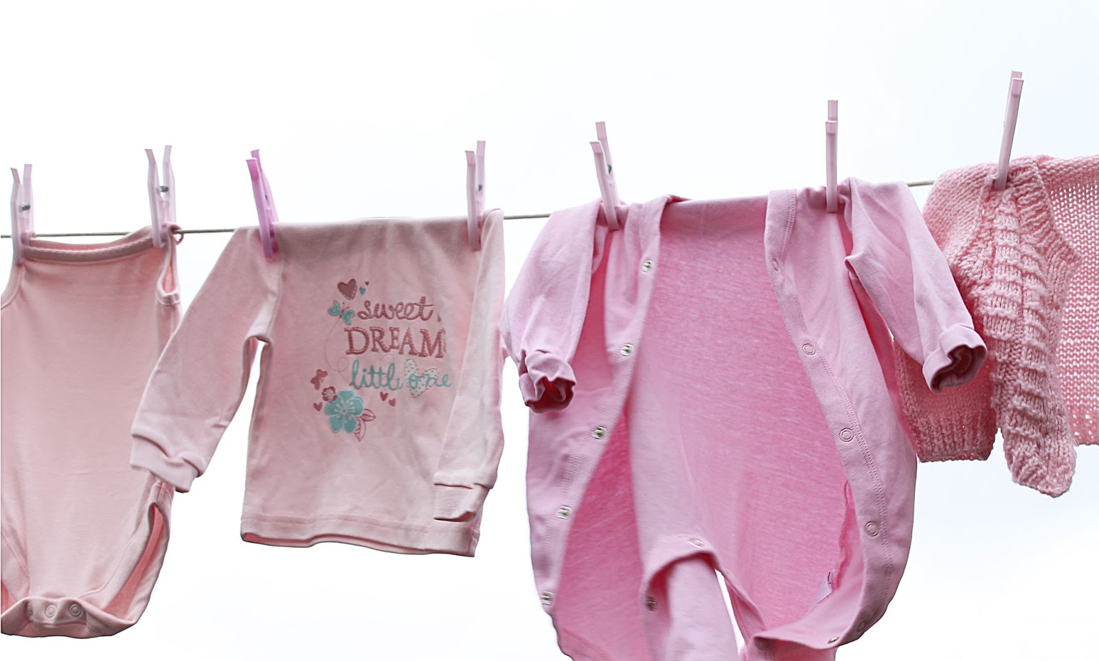
Monochromatic Colours

Monochromatic colours are all of the colours (tints, tones and shades) of a single hue. Monochromatic colour schemes are derived from a single base hue and extended using its shades, tones and tints. The above image is an example.
Examples of Monochromatic Photography:


My Monochromatic images:
Below is a contact sheet of my monochromatic images, I decided to take photos of my baby sisters clothes on a washing line, as they're all different shades and tones of pink. I like the compositions in these images but found it difficult to not get objects in the background.


Location Photography Essay
In this essay I am going to talk about different types of location photography, the equipment needed and also what planning you need to think about prior to the photoshoots. I will also cover some of the risks involved.
The health and safety issues generally run across all genres of location photography. One might take into consideration the obvious elements of using tripods in public spaces (trip hazard) and if you have umbrella attachments to tripods blowing over in the wind, you should also consider when using a camera to your eye spacial awareness of the people around you. The use of flash should be thought about in relation to peoples eyes (not too close), often landscape photographers and environmental portrait photographers will use stepladders. The obvious hazard with stepladders is falling over or somebody else falling over. All photographers should consider public liability insurance as this covers the public for any damage or accidents causing injury. Any electrical equipment used on location should be PAT tested.
The health and safety issues generally run across all genres of location photography. One might take into consideration the obvious elements of using tripods in public spaces (trip hazard) and if you have umbrella attachments to tripods blowing over in the wind, you should also consider when using a camera to your eye spacial awareness of the people around you. The use of flash should be thought about in relation to peoples eyes (not too close), often landscape photographers and environmental portrait photographers will use stepladders. The obvious hazard with stepladders is falling over or somebody else falling over. All photographers should consider public liability insurance as this covers the public for any damage or accidents causing injury. Any electrical equipment used on location should be PAT tested.
Event photography
Some examples of event photography are wedding photography,
concert photography and sports photography.
Wedding photography involves photographs of a couple before marriage
as well as the wedding and reception. Photographers usually supply wedding
photographs on a CD, DVD or USB stick. As a wedding is a one-time event, the
photographer must be prepared for the unexpected. Shooting a wedding is both
exhausting and invigorating as the photographer is constantly looking for good
angles and opportunities for candid shots. Communication and planning
time-lines before the event will alleviate many of the stresses associated with
photographing a wedding. Having a list of all the planned shots is also helpful,
as well as visiting the venue(s) the week before to see where the light is
coming from and help you plan your images a bit easier.
Typical equipment needed
for a wedding photoshoot consists of:
50mm lens; great for low light photography, with the wide
aperture of f1.8 this lens gives you eight times more light coming through the
lens opening, allow
ing you to use a faster shutter speed and avoid camera shake or a lower IS and avoid noise, or a combination of both.

ing you to use a faster shutter speed and avoid camera shake or a lower IS and avoid noise, or a combination of both.

Spare SD card; a spare SD card (or more) is important
because you don’t want to run out of memory half way through a wedding, the
more SD cards you take the more photos you can take.


Spare battery; a spare battery (or more) is also important
as you don’t want to run out of battery half way through a wedding, carrying
more than one battery means you can carry on with the wedding if your battery
dies without having to stop to charge the battery.

Spare camera; some event photographers choose to take 2 or
more cameras, the main reason for this is to use different lenses/settings on
each camera, so there’s no need to change lenses/settings and waste time.
Stepladder; a stepladder is great for getting group shots,
as you’re higher up you can get a whole group in a photo and still see all
their faces. Alternatively you can use a stepladder to take portrait photos
with a more interesting photographic angle.


Reflector/diffuser; diffusers and reflectors can make a big
difference in achieving a soft, natural looking light that flatters your
subjects.


Tripod; Tripods are vital in wedding photography, they’re
great to reduce camera shake and also when taking group shots.

Flash Gun; flash is also a very important decision. You can
choose whether to use it or not but should still take a flash gun/flash camera
regardless. Flash is important when there’s not a lot of natural light or to
light up subjects when the lighting is coming from above.

Examples of wedding photography:


Landscape photography
Landscape photography
shows spaces within the world, they typically capture the presence of nature
but can also focus on man-made features or disturbances of landscapes. The most
common reason of landscape photography is to recall a personal observation or
experience while in the outdoors, especially when travelling. Landscape
photography commonly involves daylight photography of natural features of land,
sky and waters, at a distance – though some landscapes may involve subjects in
a scenic setting nearby, even close-up and sometimes at night.
Typical equipment
needed for landscape photography consists of:
Any ordinary camera; any
film or digital camera can be used for common landscape photography, but higher
resolution and larger format digital cameras permit a greater amount of detail
and a wider range of artistic presentation. A camera with panorama function or
frame can permit very wide images suitable for capturing a panoramic view.
Tripod; a tripod
provides a stable platform for your digital camera. It allows you to take the
time to carefully compose a shot then lock down your camera in that position.
In low light conditions, using a large focal ratio and low ISO, the length of
the exposure needed to capture the scene will be fairly long. Too long to
steadily handhold the camera, so mounting your camera on a tripod will keep it
steady during long exposures that record amazing detail.
Lens; for landscape
photography, your best lens will be a wide angle. These are short focal length lenses
that deliver wide, true fields of view. A minimum focal length of 12mm is best.

Examples of landscape photography:


Environmental portrait photography
Portrait photography or portraiture is
photography of a person or group of people that displays the expression,
personality and mood of the subject. The environmental approach to portraiture depicts
the subject in their environment be that a work, leisure, social or family one.
They’re often shown doing something (a teacher in a classroom, a cashier on a
till, a child in a playground). The environmental approach helps reveal more
about the subject. It is best to go as minimal as possible with equipment for
environmental portraits, using as much natural light as possible to create the
most natural looking picture you can. Although there will always be times where
if the lighting isn’t great, you can modify it in some way. This can be done by
adding a reflector, or setting up a flash in a soft box or umbrella.
Typical equipment
needed for an environmental portraiture shoot consists of:
Lens; a 50mm lens is
great for low light locations, it gives you eight times more light coming through
the lens opening.


Tripod; using a
tripod reduces camera shake, and you can get more detail in your images. You
can also compose your image before you take it.
Lighting; a flash in
a soft box or umbrella can help when natural lighting isn’t great in a
location.

Reflector; often a
reflector is placed below the subjects face to provide fill light and soften
shadows.
Examples of environmental portrait photography:


Overview
What I’ve tried to cover in this essay is
the different pieces of equipment you need for different types of location
photography and also planning prior to each shoot. I tried to analyse the
difference between the approaches for each of the three genres.
Evaluation of Whole Unit:
No comments:
Post a Comment