Monday 5th January 2015
Abstract (Assignment 1)
This is an American wartime propaganda poster produced in 1943, an image of a strong female production worker. The poster was actually seen very little during WW2 but was rediscovered in the 1980's and was used to promote feminism and other political issues. The artist made the woman stand out by making the background one solid colour and making the woman bold and multicoloured. The poster would show most people a very strong feminist feel, but for me this image gives me a very negative feel. The poster was created to encourage women to work in industries than normally relied on male workers, then after the war finished they would go back to being a housewife and men would take their place. Women were basically being used by the government. The woman in the image is made to look strong but in reality working women were probably angry and upset that the government had gotten hard work out of them and then made them go back to being housewives.

"We Can Do It!" by J. Howard Miller, 1943
Film Still
This is a film still from the 1990 movie "Pretty Woman." The film is about Edward Lewis (Richard Gere), a wealthy businessman who hires Vivian Ward (Julia Roberts), a beautiful prostitute. He hires her to take her to business events, but an attraction begins to develop between the two, and at the end of the film Edward can't let her go. This still has a narrow depth of field and an average shutter speed, it also has very interesting lighting. The light is shining from Vivian's face and this gives the image an angelic-like feel. The photographer has used a bland background and a narrow depth of field so the focus is mainly on the 2 subjects within the frame. The mood of this image is very loving and it also has a very gentle and peaceful feel.

"Pretty Woman" photo by Ron Batzdorff, 1990
Painting
This painting is called "The Kiss" and the artist is Gustav Klimt. It was painted between 1908 and 1909, the highpoint of his "Golden Period", when he painted a number of works in a similar gilded style. The painting shows a couple embracing, their bodies entwined in elaborate robes. The work is composed of oil paint with applied layers of gold leaf, an aspect that gives it its strikingly modern yet evocative appearance. The painting is now in the Osterreichische Galerie Belvedere museum in the Belvedere palace, Vienna, and is considered Klimt's most popular work. The painting has a really emotional and loving feel, but also peaceful and light.

"The Kiss" by Gustav Klimt, 1908-1909
Photograph
This photograph is called "V-J Day in Times Square" photographed by Alfred Eisenstaedt on 14th August 1945. It portrays an American sailor kissing a woman in a white dress on Victory over Japan Day (V-J Day) in Times Square, New York. Taken with a Leica IIIa camera, the photograph was published a week later in Life magazine among many photographs of celebrations around the United States that were presented in a twelve-page section titled "Victory Celebrations." It's known under various titles, such as V-J Day in Times Square, V-Day and The Kiss. Because the artist was photographing rapidly changing events during the celebrations he did not have an opportunity to get the names and details. The photograph does not clearly show the faces of either person involved in this embrace and several people have claimed to be the subjects.

"V-J Day in Times Square" by Alfred Eisenstaedt, August 14th 1945
Antony Gormley

Sir Antony Mark David Gormley (born 30th August 1950) is a British sculptor. His best known works include the Angel of the North, a public sculpture in Gateshead in the North of England, commissioned in 1994 and erected in February 1998, Another Place on Crosby Beach near Liverpool and Event Horizon, a multi-part site installation which premiered in London in 2007, around Madison Square in New York City, in 2010 and in Sao Paulo in 2012.

"Iron Baby"

"Angel of the North"

"Exposure"
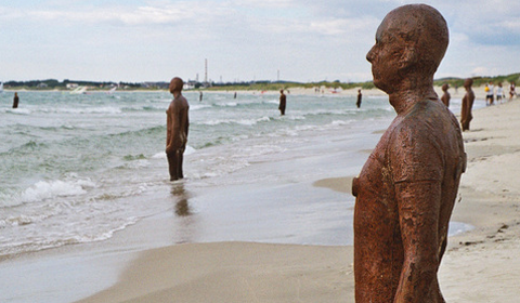
"Another Place"
Another Place consists of 100 cast-iron, life size figures spread out along three kilometres of the foreshore, stretching almost one kilometre out to sea. The Another Place figures - each one weighing 650 kilos - are made from casts of the artist's own body standing on the beach, all of them looking out to sea, staring at the horizon in silent expectation. Having previously been seen in Cuxhaven in Germany, Stavanger in Norway and De Panne in Belgium, "Another Place" is now a permanent feature in the UK, at Crosby Beach.


My Opinion:
Although I find a lot of Antony's work rather boring and not visually appealing, I really like his work "The Angel of the North" and "Another Place." I like The Angel of the North because of it's location and large size, you can see it as you drive along the A1. It's not something you'd expect to see as you're driving along the motorway, so it's very eye catching. It's size is very unexpected too, it makes it look like its name, it quite literally looks like an angel. I also like Another Place due to it's location and how many statues there are. No one goes to the beach expecting to see 100 cast-iron statues facing out to sea, so these are very shocking to see but also overwhelming. Overall I think Antony is a good artist, and you can tell he puts so much thought, time and effort into his work.
Tracey Emin
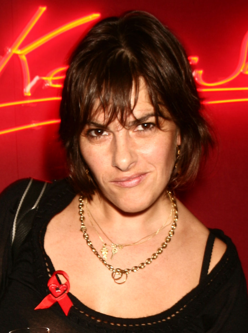
Tracey Emin (born 3rd July 1963) is an English artist. She is part of the group known as Britartists or YBAs (Young British Artists). Emin lives in Spitalfields, East London on Fournier Street in a Georgian Huguenot silk weaver's house which dates from 1726.
She is a panellist and speaker: she has lectured at the Victoria and Albert Museum in London, the European Graduate School in Saas-Fee, Switzerland, the Art Gallery of New South Wales in Sydney (2010), the Royal Academy of Arts (2008), and the Tate Britain in London (2005) about the links between creativity and autobiography, and the role of subjectivity and personal histories in constructing art. Emin's art takes many different forms of expression including needlework and sculpture, drawing, video and installation, photography and painting. In December 2011, she was appointed Professor of Drawing at the Royal Academy; with Fiona Rae, she is one of the first two female professors since the Academy was founded in 1768.
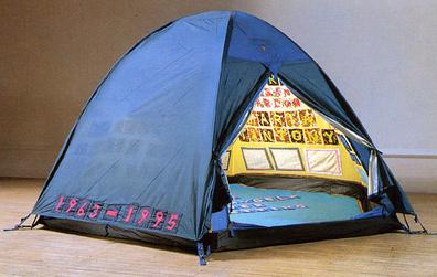
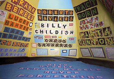
"Everyone I Have Ever Slept With"

"I Do Not Expect"

"F**k off and die you s**g"
"Unmade Bed"


"My Bed" is a work by Tracey Emin. First created in 1998, it was exhibited at the Tate Gallery in 1999 as one of the shortlisted works for the Turner Prize. It consisted of her bed with bedroom objects in an abject state, and gained much media attention. Although it did not win the prize, its notoriety has persisted. The artwork generated considerable media furor, particularly over the fact that the bedsheets were stained with bodily secretions and the floor had items from the artist's room (such as condoms, a pair of knickers with menstrual period stains, other detritus, and functional, everyday objects, including a pair of slippers). The bed was presented in the state that Emin claimed it had been when she said she had not got up from it for several days due to suicidal depression brought on by relationship difficulties.
My Opinion:
I'm in love with all of Tracey Emin's work, I really like that her work is so straight forward but shocking in a way. Even in this day and age women are expected to come across polite, clean and ladylike, Tracey's work definitely goes against this but this is what I like. I've always believed that a woman should be able to be whoever she wants and act however she wants without being labled as unladylike, inappropriate or vulgar. I particularly like "Everyone I have ever slept with". The work quite literally means everyone she has ever slept with, although some not in a sexual sense.
"Some I'd had a shag with in bed or against a wall some I had just slept with, like my grandma. I used to lay in her bed and hold her hand. We used to listen to the radio together and nod off to sleep. You don't do that with someone you don't love and care about."
Although not all of the names in the tent are meant in a sexual sense, I'm glad that some are. It shows that sex isn't a subject Tracey is afraid to talk about, and I think that's really inspiring as sex is such a taboo subject in this day and age, when really it should be something everyone feels comfortable talking about. Overall I think Tracey Emin is an amazing and inspiring artist, she definitely gives off the impression that women should be who they want to be, and I think that's very important to lots of young women today.
Assignment 2- 'Jeans'
The Brief:
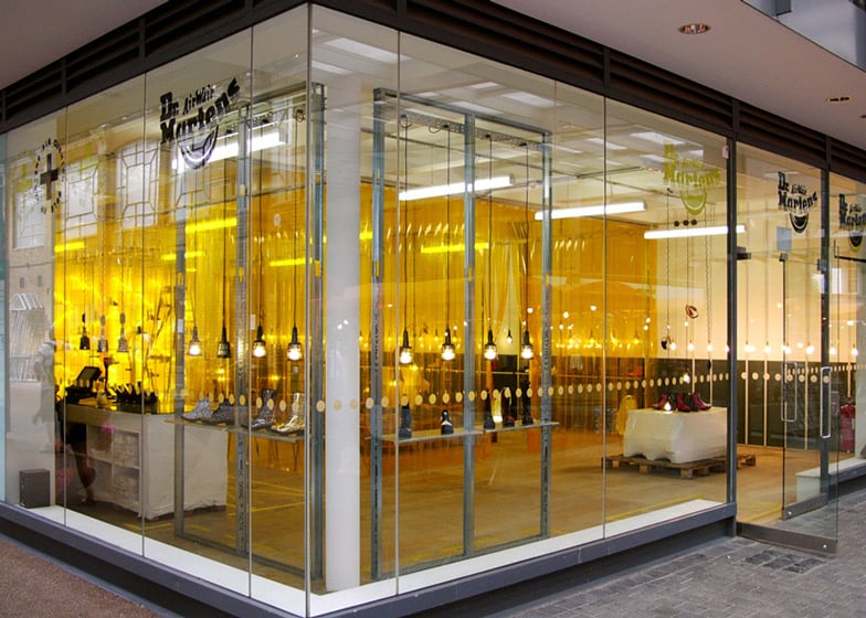
The company Doc Martens have gone into the market of Jeans. They have produced jeans in fitting with the Doc Marten product and carry the logo of DM Jeans. They wish to create an image in keeping with the vibrant market of jeans, and aim to sell to the most fashion conscious age group, namely the 17 to 26 year old buyers. The jeans are aimed at both male and female buyers. Your brief is to come up with two images to pitch to the Doc Marten executives with the specific aim of positive selling. The two images need not to be connected and may be separate advertising images.
Doc Marten Boots Research:


Dr. Martens is a British footwear and clothing brand, which also makes a range of accessories - shoe care products, clothing, luggage, etc. In addition to Dr. Martens, they are also commonly known as Doctor Martens, Doc Martens, Docs or DMs. The footwear is distinguished by its air-cushioned sole (dubbed Bouncing Soles), upper shape, welted construction and yellow stitching.
History
Klaus Martens was a doctor in the German army during WWII. While on leave in 1945, he injured his ankle while skiing in the Bavarian Alps. He found that his standard-issue army boots were too uncomfortable on his injured foot. While recuperating, he designed improvements to the boots, with soft leather and air-padded soles made of tyres. When the war ended and some Germans recovered valuables from their own cities, Martens took leather from a cobbler's shop. With that leather he made himself a pair of boots with air-cushioned soles.
Timeline: 50 Years of Doc Martens
1960 - The birth of an icon
Dr Martens go into production on 1st April 1960 at Bill Grigg's shoe factory in Wollaston, Northamptonshire. The air cushioned soles design was licensed to Grigg by German inventor Dr Klaus Maerten. Intended as orthopaedic shoes, they are marketed as industrial wear.

1966 - Height of fashion
Docs make the jump from factory floor to dance floor when the Who's lead guitarist, Pete Townshend, wears them at a gig in London. The band's mod fans follow Townshend's lead.

1975 - Rock on, Tommy
Townshend pushes the brand back into fashion, putting Elton John in an outsized pair for rock opera Tommy. Despite having to wear foot-long callipers to move, Elton keeps the boots.

1979 - Emblem of violence
The Jam sing "A bomb in Wardour Street" about a "Dr Martens apocalypse" after football hooligans adopt the boots.


1993 - Britpop revival
Dr Martens launches a clothing line with Wayne Hemingway's Red or Dead label. To celebrate the occasion, the company commissions a house tartan called "McMartens Tartan", which is still used 17 years later.


2000 - A very happy birthday
The boots' 40th is also the best year for sales, with the company selling £250m of boots in 2000 alone. A commemorative book and a Dr Martens compilation album hit the shelves and prove major earners.

2003 - End of an era?
With profits falling by 30 per cent in one year alone, the over stretched boot maker narrowly avoids bankruptcy proceedings. All but one of the company's UK factories are closed, and only a collaboration with Jimmy Choo and Vivienne Westwood prevent financial collapse.


2005 - Turnaround of the year
The company wins the Institute for Turnaround's annual award, after the Griggs restructure the company back to profitability. The firm opens a new store in Soho in 2006.

2010 - Golden oldie
To celebrate the boots' half century, the company launches a new range of products that come with a lifetime guarantee. The seven-piece For Life collection is premiered at Dr Martens' pop-up stores in London.

Doc Martens - The History
Target Audience?
The first Dr. Marten boots in the UK came out on 1st April 1960, with an eight eyelet oxblood coloured smooth leather design. The boots were popular among workers such as postmen, police officers and factory workers.

By the early 1970's skinheads started wearing them, they were most popular with skinheads which led the brand gaining an association with violence.


By the late 1980's they were popular among scooter riders, punks and new wave musicians.


By the 1990's they became popular as grunge fashion arose.


In 2004 a new range of Dr. Martens was launched in an attempt to appeal to a wider market, and especially young people. The shoes and boots were intended to be more comfortable, and easier to break in, and included some new design elements. They began producing footwear again at the Cobbs Lane Factory, these products are part of the "Vintage" line, which the company advertises as being made to the original specifications.
Planning:
Mind Map

My mind map shows everything I'd ideally like to include in my shoot. I really thought about what would look effective and what would appeal most to my target audience.
Mood Board

My mood board shows images that inspire me and what I'd like my images to look like.
My Target Audience:
I decided that my DM jeans would target teenagers and young adults, both male and female but especially female. I want my jeans to be affordable for students but also comfortable and long lasting. I also want my shoot to promote positive body image.
Final Images:


Evaluation:
I think I worked really well on my research for this assignment, there's lots of research and a wide range of it. However, I think I didn't work very well on my photos. I planned to have 1 male and 1 female in my shoot and I succeeded with that, and I also succeeded in making my images straight to the point. I wanted to promote positive body image by having a wide range of different sized models, but this was difficult to do in college. Even though I couldn't get a wide size range of models, one of my models was very slim and the other slightly curvier, and that's the best I could do in the circumstances. I'm really happy with how my final photos turned out and I like the studio techniques I used, but If I could do this assignment again, I'd do 2 or 3 shoots instead of just 1. Overall, I feel quite neutral towards this assignment.
Triptychs
A triptych is a painting made up of three sections. Such constructions are usually made of two 'wings' or 'shutters' attached to either side of a central panel. Sometimes the panels are hinged so that the wings can be closed to protect the major image painted in the middle. The scale of triptychs varies enormously; they range from small works for domestic devotion to major altarpieces.
History of Triptychs
Church Images


Inspiration/Planning
Church Images

The San Giovenale Triptych by Masaccio, 1422
The San Giovenale Triptych or Cascia Altarpiece is a 1422 painting by Italian Renaissance artist Masaccio, housed in a museum behind the church of Cascia di Reggello, in the Roman Pieve of San Pietro di Cascia near Florence, Italy. The work was discovered in 1961 in a state of poor preservation, in the loft of a house adjacent to the small chapel of San Giovenale two kilometres from Cascia by Juliana Arnetoli. It had allegedly been hidden there before the Second World War to prevent the occupying German army from removing it from the chapel. It is probably the first original work by Masaccio. It was commissioned by the Florentine family of Castellani for the Basilica of San Lorenzo, and was later moved to San Giovenale.

Triptych at St Augustine's Church, Solihull, West Midlands
The origins of this triptych are uncertain, it is thought to be a gift from Pugin. It's the work of a Flemish artist and although it was later painted, it's in the style of the school of Rogier Van Der Weyden. Wooden triptychs were often used as portable altarpieces with their protective folding doors. The central panel is a depiction of the crucifixion with our lady, St Mary Magdalene and St John. The side panels' subjects are St Jerome and St John the Baptist on the left and St Anthony the Hermit and St Francis of Assisi on the right.
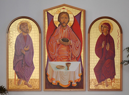
Altar triptych at Saint Mary Roman Catholic Church, Trenton, Illnois, USA
I couldn't find any information on this triptych online, only where it's location is. This is the only thing I found on this triptych:
"Above the altar is this triptych, showing Cleopos and the other disciple, who met our Lord on the road to Emmaus on the day of his resurrection, although they did not know him. Eventually, they recognized Jesus in the breaking of the bread."
"Above the altar is this triptych, showing Cleopos and the other disciple, who met our Lord on the road to Emmaus on the day of his resurrection, although they did not know him. Eventually, they recognized Jesus in the breaking of the bread."
Inspiration/Planning

I really like the colours to this triptych, it has a very bright and happy mood.

This triptych shows how I want my triptychs to turn out, I only want to photograph my family's faces, hands and feet. Although this looks slightly distorted I think it's very effective.

I like the individual images to this triptych, they have good lighting and I like the gradual change of the liquid in the glass, but I don't think it's an effective triptych.
%2C_Sagrada_Familia_con_a%CC%81ngel_mu%CC%81sico%2C_Santa_Catalina_de_Alejandri%CC%81a%2C_Santa_Ba%CC%81rbara%2C_1510-1520%2C_Museo_del_Prado%2C_Madrid..jpg)
I like the colours and lighting in the paintings of this triptych, but I find church triptychs rather boring.

I really like how effective the vanishing point of this triptych is, and I also like the colours in the images. It's very bright and vibrant.

I really like the contrast between the sky and the flowers in this triptych, although I think the colours slightly clash. I like the effectiveness of the vanishing point.

This triptych has a very mysterious and slightly disturbing vibe, but I still think it's very effective. I think the black and white really suits this, and it wouldn't be as effective in colour.

Again this triptych inspires me for my own triptychs, I only want to photograph my family's faces, hands and feet. The look on the mans face and the black and white gives it a very gloomy mood but it's still very effective.
My Theme:
For my triptychs I decided I'd go with the theme of family. My family are the most important people in my life so I thought this would be really interesting to work and experiment with in this assignment. I also decided that in my triptychs I wouldn't photograph my family members whole body, only their face, hands and feet. I chose to do this because although it looks strange and slightly distorted without a body, it looks really effective and moving.
Leila
Contact Sheet

Triptychs

I prefer this triptych in black and white as I think it lets you pay attention to the details more than it would if it was in colour, I really like the composition of the second and third images but not the first image, I think I could've chose an image with a better composition for the first panel.

I really like the pink and white colour scheme to this triptych, especially as the images are of my baby sister and pink is a colour which fits in with baby girls. I like the details of my images and I think it's better that my sister has a straight face instead of smiling, because this gives the triptych a more serious and moving touch.
Malachi
Contact Sheet

Triptychs

I chose to experiment with this triptych and discovered that it looked much better in black and white, the lighting and exposure of the images look really effective in black and white and lets you see the details much clearer.

Although the detail isn't as clear in this triptych because it's in colour, I really like the blue/green colour scheme because this gives it a real little "boy" feel. I especially like the lighting and contrast in these images, they wouldn't look as good if the contrast and lighting was any higher or lower.
Final Piece
Evaluation:
I feel neutral towards my research for this assignment, I worked hard on it but I know I could've done slightly more research and planning. However, I'm really happy with how my images and triptychs turned out. Even though the pictures were quite effortless and not time consuming, they have a real happy and "family" vibe to them, which is what I was aiming for. Overall, I'm happy with the outcome.
5 Minute Photographer Research Presentation

The artist I have chosen is Annie Leibovitz. I decided to do my presentation on her because I have always enjoyed her work and find her inspiring. Anna-Lou "Annie" Leibovitz is an american portrait photographer, born October 2nd 1949 in Connecticut, US.

In 1970 she started her career as staff photographer working for just launched Rolling Stone magazine. In 1973 publisher Jann Wenner named Leibovitz chief photographer of Rolling Stone, a job that she would hold for 10 years. She worked for the magazine until 1983, and her intimate photographs of celebrities helped define the Rolling Stone look.

On December 1980 Annie was assigned to photograph John Lennon and Yoko Ono. Initially Annie attempted to photograph just John alone but he insisted that Yoko be on the cover too. Inspired by the album cover of Double Fantasy, Annie tried to recreate something like it, she imagined they would pose nude together. Yoko was reluctant to take her clothes off, so Annie told her to leave everything on. John curled up beside her naked and Annie used an instant camera to capture the moment. Annie was the last person to professionally photograph Lennon, as he was shot dead just hours later. The photograph of John and Yoko ran on the January 1981 cover of Rolling Stone magazine to commemorate the former Beatle. In 2005 it was voted the best magazine cover of the last 40 years by the American Society of Magazine Editors.

Since 2007 Disney has been releasing a series of advertisements created by Annie, featuring celebrities in Disney fairytale scenes to promote Disney parks "Year of a Million Dreams."

Jessica Chastain as Merida from Brave
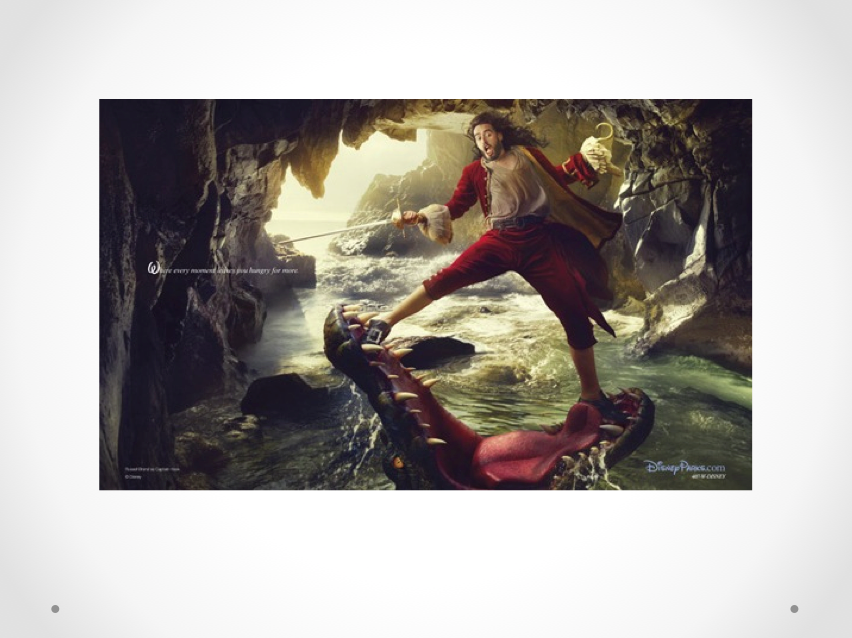
Russell Brand as Captain Hook

Whoopee Goldberg as Genie from Aladdin

Queen Latifah as Ursula from The Little Mermaid

Scarlett Johansson as Cinderella

And many more

After working at Rolling Stone for 10 years, Annie accepted a job from Mick Jagger to work as the official tour photographer for the Rolling Stones - against the advice of her boss Jann Wenner. Her favourite photo from the tour was of Mick Jagger in an elevator, she also photographed the Rolling Stones in San Francisco in 1971 and 1972. Annie stated "I didn't know what I was getting myself into. I was unbelievably stupid to pick that group of men and that situation to decide to become part of something." She also later admitted to a problem with cocaine and beating it when she moved to Vanity Fair in 1983.

Annie said some of her most important work was a series of photos she took of her partner, essayist Susan Sontag. She said Susan had extremely high expectations for the photos, which Annie found frustrating. After Susan died of Myelodysplastic Syndrome in 2004, Annie looked back at photos and said she was proud. During their close relationship, neither woman publicly disclosed whether their relationship was a platonic friendship or romantic.

Annie Leibovitz is one of my favourite photographers and in my opinion is one of the most influential female photographers today. My favourite piece of work by Leibovitz is her portrait of Queen Elizabeth. The portrait shows Elizabeth seated in a dark room in Buckingham Palace, being lit only by light from an open window, the photo has a fairytale feel that no other recent royal portraitist has achieved. I love that her portraits are striking, rich in colour but also intimate. Her work has inspired me for many years and continues to inspire many amateur photographers.

Evaluation:
When I first gave my presentation, I wasn't very well prepared at all. I didn't have enough information wrote down, I didn't have enough images on my slide show and it just wasn't long enough. I worked on my presentation further, added much more information, pictures and practiced giving my presentation. When I gave my presentation the following week, it went much better, it was much longer and I was more prepared and confident when speaking. Overall, I feel quite neutral towards this assignment. My work wasn't as good as it should've been but it was still satisfactory.
No comments:
Post a Comment